
Table of Contents
- Used Stack
- New and updated NPM Packages
- New Header Component for Dashboard Page
- New Components for New Widgets
- TopDeviceWidget
- TopLocationsWidget
- TopSourceWidget
- TrendWidget
- Upgrade to tremor/react 3.1
- New Styling for the Dashboard
- Complete tailwind.config.ts
- Global.css
- And here is the final result with the new widgets
- Cloudapp-dev, and before you leave us
In this post, we will proceed with our analytics dashboard. We will add new styling with TailwindCss and new Widgets to our Dashboard, which we created in our existing Nextjs 14 project.
Here is the GitHub repo with the entire code. Below, you will find the link to the example page.
Example page hosted on Vercel -> https://nextjs14-kafka-tracking.vercel.app/
Used Stack
I will start with my default stack:
Next.js 14 as the web framework, and I will use the provided middleware edge function
TailwindCss for Styling
Contentful CMS (Free Plan)
Tinybird for Data Collection and Analytics
Vercel for hosting
New and updated NPM Packages
We need to install the new “@tailwindcss/forms” package and upgrade the tremor/react package from 2.0.2 to 3.10
// new
"@tailwindcss/forms": "^0.5.7",
// upgrade from
"@tremor/react": "^2.0.2",
// to
"@tremor/react": "^3.10.0",
New Header Component for Dashboard Page
We create a new Component to wrap the DateFilter and CurrentVisitors components.
"use client";
import DateFilter from "@/components/webanalytics/DateFilter";
import CurrentVisitors from "@/components/webanalytics/CurrentVisitors";
import useDomain from "@/lib/hooks/use-domain";
import Image from "next/image";

export default function AnalyticsHeader() {
  const { domain, logo, handleLogoError } = useDomain();

  return (
    <div className="flex justify-between flex-col lg:flex-row gap-6 mb-4">
      <div className="flex gap-2 md:gap-10 justify-between md:justify-start">
        <h1 className="flex items-center gap-2 min-w-max">
          <Image
            src={logo}
            alt=""
            width={16}
            height={16}
            onError={handleLogoError}
            loading="lazy"
          />
          <span className="text-lg leading-6">{domain}</span>
        </h1>
        <CurrentVisitors />
      </div>
      <DateFilter />
    </div>
  );
}
And then, we import the new component into our Dashboard pages, replacing the old component.
// new import
import AnalyticsHeader from "@/components/webanalytics/AnalyticsHeader";

// old import, now wrapped in the new component
import DateFilter from "@/components/webanalytics/DateFilter";
New Components for New Widgets
CurrentVisitors is the widget we used in the new AnalyticsHeader.tsx
"use client";
import useCurrentVisitors from "@/lib/hooks/use-current-visitors";

export default function CurrentVisitors() {
  const currentVisitors = useCurrentVisitors();
  return (
    <div className="flex items-center gap-2">
      <span className="rounded-full h-2 w-2 bg-blue-500" />
      <p className="text-[#636679] text-sm truncate">{`${currentVisitors} current visitor${
        currentVisitors === 1 ? "" : "s"
      }`}</p>
    </div>
  );
}
TopDeviceWidget
"use client";
import { Fragment } from "react";
import { DonutChart } from "@tremor/react";
import Widget from "../Widget";
import useTopDevices from "@/lib/hooks/use-top-devices";
import { formatNumber } from "@/lib/utils";
import { tremorPieChartColors } from "@/styles/theme/tremor-colors";

export default function TopDevicesWidget() {
  const { data, warning, status } = useTopDevices();

  return (
    <Widget>
      <Widget.Title>Top Devices</Widget.Title>
      <Widget.Content
        status={status}
        noData={!data?.data?.length}
        warning={warning?.message}
      >
        <div className="w-full h-full grid grid-cols-2">
          <DonutChart
            data={data?.data ?? []}
            category="visits"
            index="device"
            colors={tremorPieChartColors.map(([color]) => color)}
            showLabel={false}
            valueFormatter={formatNumber}
          />
          <div className="justify-self-end">
            <div className="grid grid-cols-2 gap-y-1 gap-4">
              <div className="text-xs tracking-widest font-medium uppercase text-center truncate">
                Device
              </div>
              <div className="text-xs tracking-widest font-medium uppercase text-right truncate">
                Visitors
              </div>
              {(data?.data ?? []).map(({ device, visits }, index) => (
                <Fragment key={device}>
                  <div className="flex items-center gap-2 text-sm leading-5 text-neutral-64 h-9 px-4 py-2 rounded-md z-10">
                    <div
                      className="h-4 min-w-[1rem]"
                      style={{
                        backgroundColor: tremorPieChartColors[index][1],
                      }}
                    />
                    <span>{device}</span>
                  </div>
                  <div className="flex items-center justify-end text-neutral-64 h-9">
                    {formatNumber(visits)}
                  </div>
                </Fragment>
              ))}
            </div>
          </div>
        </div>
      </Widget.Content>
    </Widget>
  );
}
TopLocationsWidget
"use client";
import Widget from "../Widget";
import useTopLocations from "@/lib/hooks/use-top-locations";
import { BarList } from "@tremor/react";
import { useMemo } from "react";
import useParams from "@/lib/hooks/use-params";
import { TopLocationsSorting } from "@/types/top-locations";
import { cx } from "@/lib/utils";

export default function TopLocationsWidget() {
  const { data, status, warning } = useTopLocations();
  const [sorting, setSorting] = useParams({
    key: "top_locations_sorting",
    values: Object.values(TopLocationsSorting),
  });
  const chartData = useMemo(
    () =>
      (data?.data ?? []).map((d) => ({
        name: d.location,
        value: d[sorting],
      })),
    [data?.data, sorting]
  );

  return (
    <Widget>
      <Widget.Title>Top Pages</Widget.Title>
      <Widget.Content
        status={status}
        noData={!data?.data?.length}
        warning={warning?.message}
      >
        <div className="grid grid-cols-5 gap-x-4 gap-y-2">
          <div className="col-span-3 text-xs font-semibold tracking-widest text-gray-500 uppercase h-5">
            Country
          </div>
          <div
            className={cx(
              "col-span-1 font-semibold text-xs text-right tracking-widest uppercase cursor-pointer h-5",
              sorting === TopLocationsSorting.Visitors && "text-primary"
            )}
            onClick={() => setSorting(TopLocationsSorting.Visitors)}
          >
            Visits
          </div>
          <div
            className={cx(
              "col-span-1 font-semibold text-xs text-right tracking-widest uppercase cursor-pointer h-5",
              sorting === TopLocationsSorting.Pageviews && "text-primary"
            )}
            onClick={() => setSorting(TopLocationsSorting.Pageviews)}
          >
            Pageviews
          </div>

          <div className="col-span-3">
            <BarList data={chartData} valueFormatter={(_: any) => ""} />
          </div>
          <div className="flex flex-col col-span-1 row-span-4 gap-2">
            {(data?.data ?? []).map(({ location, visits }) => (
              <div
                key={location}
                className="flex items-center justify-end w-full text-neutral-64 h-9"
              >
                {visits}
              </div>
            ))}
          </div>
          <div className="flex flex-col col-span-1 row-span-4 gap-2">
            {(data?.data ?? []).map(({ location, hits }) => (
              <div
                key={location}
                className="flex items-center justify-end w-full text-neutral-64 h-9"
              >
                {hits}
              </div>
            ))}
          </div>
        </div>
      </Widget.Content>
    </Widget>
  );
}
TopSourceWidget
"use client";
import { BarList } from "@tremor/react";
import Widget from "../Widget";
import useTopSources from "@/lib/hooks/use-top-sources";
import { formatNumber } from "@/lib/utils";
import { useMemo } from "react";

export default function TopSourcesWidget() {
  const { data, status, warning } = useTopSources();
  const chartData = useMemo(
    () =>
      (data?.data ?? []).map((d) => ({
        name: d.referrer,
        value: d.visits,
        href: d.href,
      })),
    [data?.data]
  );

  return (
    <Widget>
      <Widget.Title>Top Sources</Widget.Title>
      <Widget.Content
        status={status}
        noData={!chartData?.length}
        warning={warning?.message}
      >
        <div className="grid grid-cols-5 gap-x-4 gap-y-2">
          <div className="col-span-4 text-xs font-semibold tracking-widest text-gray-500 uppercase h-5">
            Refs
          </div>
          <div className="col-span-1 font-semibold text-xs text-right tracking-widest uppercase h-5">
            Visitors
          </div>

          <div className="col-span-4">
            <BarList data={chartData} valueFormatter={(_: any) => ""} />
          </div>
          <div className="flex flex-col col-span-1 row-span-4 gap-2">
            {(data?.data ?? []).map(({ referrer, visits }) => (
              <div
                key={referrer}
                className="flex items-center justify-end w-full text-neutral-64 h-9"
              >
                {formatNumber(visits ?? 0)}
              </div>
            ))}
          </div>
        </div>
      </Widget.Content>
    </Widget>
  );
}
TrendWidget
"use client";
import { BarChart } from "@tremor/react";
import Widget from "../Widget";
import useTrend from "@/lib/hooks/use-trend";
import { useMemo } from "react";
import moment from "moment";

export default function TrendWidget() {
  const { data, status, warning } = useTrend();
  const chartData = useMemo(
    () =>
      (data?.data ?? []).map((d) => ({
        Date: moment(d.t).format("HH:mm"),
        "Number of visits": d.visits,
      })),
    [data]
  );

  return (
    <Widget>
      <div className="flex items-center justify-between">
        <Widget.Title>Users in last 30 minutes</Widget.Title>
        <h3 className="text-neutral-64 font-normal text-xl">
          {data?.totalVisits ?? 0}
        </h3>
      </div>
      <Widget.Content
        status={status}
        loaderSize={40}
        noData={!chartData?.length}
        warning={warning?.message}
      >
        <BarChart
          data={chartData}
          index="Date"
          categories={["Number of visits"]}
          colors={["blue"]}
          className="h-32"
          showXAxis={false}
          showYAxis={false}
          showLegend={false}
          showGridLines={false}
        />
      </Widget.Content>
    </Widget>
  );
}
Upgrade to tremor/react 3.1
Due to the upgrade we have t adapt the Datefilter.tsx (src/components/webanalytics) and the hook file use-date-filter.ts (src/lib/hooks). In the old npm package 2.0.2 the type DateRangePicker was of type array (startdate, enddate, value), but now it changed.
"use client";
import { Popover } from "@headlessui/react";
// import { DateRangePicker } from "@tremor/react";
import {
  DateRangePicker,
  DateRangePickerValue,
  DateRangePickerItem,
} from "@tremor/react";
import moment from "moment";
import { QuestionIcon } from "./Icons";

import {
  DateFilter as DateFilterType,
  DateRangePickerOption,
} from "@/types/date-filter";
import useDateFilter from "@/lib/hooks/use-date-filter";

const dateFilterOptions: DateRangePickerOption[] = [
  { text: "Today", value: DateFilterType.Today, startDate: new Date() },
  {
    text: "Yesterday",
    value: DateFilterType.Yesterday,
    startDate: moment().subtract(1, "days").toDate(),
  },
  {
    text: "7 days",
    value: DateFilterType.Last7Days,
    startDate: moment().subtract(7, "days").toDate(),
  },
  {
    text: "30 days",
    value: DateFilterType.Last30Days,
    startDate: moment().subtract(30, "days").toDate(),
  },
  {
    text: "12 months",
    value: DateFilterType.Last12Months,
    startDate: moment().subtract(12, "months").toDate(),
  },
];

export default function DateFilter() {
  const { dateRangePickerValue, onDateRangePickerValueChange } =
    useDateFilter();

  return (
    <div className="flex items-center gap-4">
      <Popover className="relative h-4">
        <Popover.Button>
          <QuestionIcon className="text-[#A5A7B4]" />
          {/* <QuestionIcon className="text-secondaryLight" /> */}
          <div className="sr-only">What is the time zone used?</div>
        </Popover.Button>

        <Popover.Panel className="absolute bottom-6 -right-10 bg-[#25283D] dark:text-black text-white text-xs font-light rounded py-1 px-2 z-[2] w-24">
          UTC timezone
        </Popover.Panel>
      </Popover>

      <div className="min-w-[165px]">
        <DateRangePicker
          value={dateRangePickerValue}
          onValueChange={onDateRangePickerValueChange}
          enableYearNavigation={true}
          className="daterangepicker-custom"
        >
          {dateFilterOptions.map((option) => (
            <DateRangePickerItem
              key={option.text}
              value={option.value}
              from={option.startDate}
            >
              {option.text}
            </DateRangePickerItem>
          ))}
        </DateRangePicker>
      </div>
    </div>
  );
}
Hook File
"use client";
import moment from "moment";
import { useRouter, useSearchParams } from "next/navigation";
import { useCallback, useEffect, useMemo, useState } from "react";
import { DateRangePickerValue } from "@tremor/react";
import { DateFilter, dateFormat } from "@/types/date-filter";

export default function useDateFilter() {
  const router = useRouter();
  const searchParams = useSearchParams();
  const params = new URLSearchParams(searchParams.toString());
  const [dateRangePickerValue, setDateRangePickerValue] =
    useState<DateRangePickerValue>();

  const setDateFilter = useCallback(
    ({ from, to, selectValue }: DateRangePickerValue) => {
      const lastDays = selectValue ?? DateFilter.Custom;
      const startDate = from;
      const endDate = to;

      params.set("last_days", lastDays);

      if (lastDays === DateFilter.Custom && startDate && endDate) {
        params.set("start_date", moment(startDate).format(dateFormat));
        params.set("end_date", moment(endDate).format(dateFormat));
      } else {
        params.delete("start_date");
        params.delete("end_date");
      }

      router.push("/dashboard?" + params.toString(), { scroll: false });
    },
    // eslint-disable-next-line react-hooks/exhaustive-deps
    []
  );

  const lastDaysParam = searchParams?.get("last_days") as DateFilter;
  const lastDays: DateFilter =
    typeof lastDaysParam === "string" &&
    Object.values(DateFilter).includes(lastDaysParam)
      ? lastDaysParam
      : DateFilter.Last7Days;

  const { startDate, endDate } = useMemo(() => {
    const today = moment().utc();
    if (lastDays === DateFilter.Custom) {
      const startDateParam = searchParams?.get("start_date") as string;
      const endDateParam = searchParams?.get("end_date") as string;

      const startDate =
        startDateParam ||
        moment(today)
          .subtract(+DateFilter.Last7Days, "days")
          .format(dateFormat);
      const endDate = endDateParam || moment(today).format(dateFormat);

      return { startDate, endDate };
    }

    const startDate = moment(today)
      .subtract(+lastDays, "days")
      .format(dateFormat);
    const endDate =
      lastDays === DateFilter.Yesterday
        ? moment(today)
            .subtract(+DateFilter.Yesterday, "days")
            .format(dateFormat)
        : moment(today).format(dateFormat);

    return { startDate, endDate };
  }, [
    lastDays,
    searchParams,
    // searchParams?.get("start_date"),
    // searchParams?.get("end_date"),
  ]);

  useEffect(() => {
    const vallastDays = lastDays === DateFilter.Custom ? "" : lastDays;
    setDateRangePickerValue({
      from: moment(startDate).toDate(),
      to: moment(endDate).toDate(),
      selectValue: vallastDays,
    });
  }, [startDate, endDate, lastDays]);

  const onDateRangePickerValueChange = useCallback(
    ({ from, to, selectValue }: DateRangePickerValue) => {
      if (startDate && endDate) {
        setDateFilter({ from, to, selectValue });
      } else {
        setDateRangePickerValue({ from, to, selectValue });
      }
    },
    [setDateFilter, startDate, endDate]
  );

  return {
    startDate,
    endDate,
    dateRangePickerValue,
    onDateRangePickerValueChange,
  };
}
New Styling for the Dashboard
Now the new logic is in place, and therefore, we are gonna style it.
//tailwind.config.ts
//new imports
import type { Config } from "tailwindcss";
import colors from "tailwindcss/colors";
const {
  colors_tremor,
  typography,
} = require("./src/styles/theme/default-colors");
const { tremorPieChartColors } = require("./src/styles/theme/tremor-colors");

// new safelist
  safelist: [
    {
      pattern:
        /^(bg-(?:slate|gray|zinc|neutral|stone|red|orange|amber|yellow|lime|green|emerald|teal|cyan|sky|blue|indigo|violet|purple|fuchsia|pink|rose)-(?:50|100|200|300|400|500|600|700|800|900|950))$/,
      variants: ["hover", "ui-selected"],
    },
    {
      pattern:
        /^(text-(?:slate|gray|zinc|neutral|stone|red|orange|amber|yellow|lime|green|emerald|teal|cyan|sky|blue|indigo|violet|purple|fuchsia|pink|rose)-(?:50|100|200|300|400|500|600|700|800|900|950))$/,
      variants: ["hover", "ui-selected"],
    },
    {
      pattern:
        /^(border-(?:slate|gray|zinc|neutral|stone|red|orange|amber|yellow|lime|green|emerald|teal|cyan|sky|blue|indigo|violet|purple|fuchsia|pink|rose)-(?:50|100|200|300|400|500|600|700|800|900|950))$/,
      variants: ["hover", "ui-selected"],
    },
    {
      pattern:
        /^(ring-(?:slate|gray|zinc|neutral|stone|red|orange|amber|yellow|lime|green|emerald|teal|cyan|sky|blue|indigo|violet|purple|fuchsia|pink|rose)-(?:50|100|200|300|400|500|600|700|800|900|950))$/,
    },
    {
      pattern:
        /^(stroke-(?:slate|gray|zinc|neutral|stone|red|orange|amber|yellow|lime|green|emerald|teal|cyan|sky|blue|indigo|violet|purple|fuchsia|pink|rose)-(?:50|100|200|300|400|500|600|700|800|900|950))$/,
    },
    {
      pattern:
        /^(fill-(?:slate|gray|zinc|neutral|stone|red|orange|amber|yellow|lime|green|emerald|teal|cyan|sky|blue|indigo|violet|purple|fuchsia|pink|rose)-(?:50|100|200|300|400|500|600|700|800|900|950))$/,
    },
  ]

// new plugins
plugins: [
    require("@headlessui/tailwindcss"),
    require("@tailwindcss/forms"),
    function ({ addVariant }: { addVariant: any }) {
      addVariant("state-active", '&[data-state="active"]');
    },
  ],
Complete tailwind.config.ts
Below the complete code
import type { Config } from "tailwindcss";
import colors from "tailwindcss/colors";
const { fontFamily } = require("tailwindcss/defaultTheme");
const {
  colors_tremor,
  typography,
} = require("./src/styles/theme/default-colors");
const { tremorPieChartColors } = require("./src/styles/theme/tremor-colors");

const config: Config = {
  darkMode: "class",
  content: [
    "./src/components/**/*.{js,ts,jsx,tsx,mdx}",
    "./node_modules/@tremor/**/*.{js,ts,jsx,tsx,mdx}",
    "./src/app/**/*.{js,ts,jsx,tsx,mdx}",
  ],
  theme: {
    transparent: "transparent",
    current: "currentColor",
    extend: {
      colors: {
        // light mode
        tremor: {
          brand: {
            faint: colors.blue[50],
            muted: colors.blue[200],
            subtle: colors.blue[400],
            DEFAULT: colors.blue[500],
            emphasis: colors.blue[700],
            inverted: colors.white,
          },
          background: {
            muted: colors.gray[50],
            subtle: colors.gray[100],
            DEFAULT: colors.white,
            emphasis: colors.gray[700],
          },
          border: {
            DEFAULT: colors.gray[200],
          },
          ring: {
            DEFAULT: colors.gray[200],
          },
          content: {
            subtle: colors.gray[400],
            DEFAULT: colors.gray[500],
            emphasis: colors.gray[700],
            strong: colors.gray[900],
            inverted: colors.white,
          },
        },
        // dark mode
        "dark-tremor": {
          brand: {
            faint: "#0B1229",
            muted: colors.blue[950],
            subtle: colors.blue[800],
            DEFAULT: colors.blue[500],
            emphasis: colors.blue[400],
            inverted: colors.blue[950],
          },
          background: {
            muted: "#131A2B",
            subtle: colors.gray[800],
            DEFAULT: colors.gray[900],
            emphasis: colors.gray[300],
          },
          border: {
            DEFAULT: colors.gray[800],
          },
          ring: {
            DEFAULT: colors.gray[800],
          },
          content: {
            subtle: colors.gray[600],
            DEFAULT: colors.gray[500],
            emphasis: colors.gray[200],
            strong: colors.gray[50],
            inverted: colors.gray[950],
          },
        },
      },
      maxWidth: {
        "8xl": "90rem",
      },
      letterSpacing: {
        snug: "-0.011em",
      },
      boxShadow: {
        // light
        "tremor-input": "0 1px 2px 0 rgb(0 0 0 / 0.05)",
        "tremor-card":
          "0 1px 3px 0 rgb(0 0 0 / 0.1), 0 1px 2px -1px rgb(0 0 0 / 0.1)",
        "tremor-dropdown":
          "0 4px 6px -1px rgb(0 0 0 / 0.1), 0 2px 4px -2px rgb(0 0 0 / 0.1)",
        // dark
        "dark-tremor-input": "0 1px 2px 0 rgb(0 0 0 / 0.05)",
        "dark-tremor-card":
          "0 1px 3px 0 rgb(0 0 0 / 0.1), 0 1px 2px -1px rgb(0 0 0 / 0.1)",
        "dark-tremor-dropdown":
          "0 4px 6px -1px rgb(0 0 0 / 0.1), 0 2px 4px -2px rgb(0 0 0 / 0.1)",
      },
      borderRadius: {
        "tremor-small": "0.375rem",
        "tremor-default": "0.5rem",
        "tremor-full": "9999px",
      },
      fontSize: {
        "2xs": "0.625rem",
        "3xl": "1.75rem",
        "4xl": "2.5rem",
        "tremor-label": ["0.75rem", { lineHeight: "1rem" }],
        "tremor-default": ["0.875rem", { lineHeight: "1.25rem" }],
        "tremor-title": ["1.125rem", { lineHeight: "1.75rem" }],
        "tremor-metric": ["1.875rem", { lineHeight: "2.25rem" }],
      },
      lineHeight: {
        tighter: "1.1",
      },
      fontFamily: {
        sans: ["var(--font-urbanist)", ...fontFamily.sans],
        // sans: [typography.fontFamily, ...fontFamily.sans],
      },
      gridTemplateRows: {
        "2-auto": "repeat(2, auto)",
        "3-auto": "repeat(3, auto)",
      },
    },
  },
  safelist: [
    {
      pattern:
        /^(bg-(?:slate|gray|zinc|neutral|stone|red|orange|amber|yellow|lime|green|emerald|teal|cyan|sky|blue|indigo|violet|purple|fuchsia|pink|rose)-(?:50|100|200|300|400|500|600|700|800|900|950))$/,
      variants: ["hover", "ui-selected"],
    },
    {
      pattern:
        /^(text-(?:slate|gray|zinc|neutral|stone|red|orange|amber|yellow|lime|green|emerald|teal|cyan|sky|blue|indigo|violet|purple|fuchsia|pink|rose)-(?:50|100|200|300|400|500|600|700|800|900|950))$/,
      variants: ["hover", "ui-selected"],
    },
    {
      pattern:
        /^(border-(?:slate|gray|zinc|neutral|stone|red|orange|amber|yellow|lime|green|emerald|teal|cyan|sky|blue|indigo|violet|purple|fuchsia|pink|rose)-(?:50|100|200|300|400|500|600|700|800|900|950))$/,
      variants: ["hover", "ui-selected"],
    },
    {
      pattern:
        /^(ring-(?:slate|gray|zinc|neutral|stone|red|orange|amber|yellow|lime|green|emerald|teal|cyan|sky|blue|indigo|violet|purple|fuchsia|pink|rose)-(?:50|100|200|300|400|500|600|700|800|900|950))$/,
    },
    {
      pattern:
        /^(stroke-(?:slate|gray|zinc|neutral|stone|red|orange|amber|yellow|lime|green|emerald|teal|cyan|sky|blue|indigo|violet|purple|fuchsia|pink|rose)-(?:50|100|200|300|400|500|600|700|800|900|950))$/,
    },
    {
      pattern:
        /^(fill-(?:slate|gray|zinc|neutral|stone|red|orange|amber|yellow|lime|green|emerald|teal|cyan|sky|blue|indigo|violet|purple|fuchsia|pink|rose)-(?:50|100|200|300|400|500|600|700|800|900|950))$/,
    },
  ],
  plugins: [
    require("@headlessui/tailwindcss"),
    require("@tailwindcss/forms"),
    require("@tailwindcss/typography"),
    function ({ addVariant }: { addVariant: any }) {
      addVariant("state-active", '&[data-state="active"]');
    },
  ],
};
export default config;
Global.css
The global.css was adapted as well
@tailwind base;
@tailwind components;
@tailwind utilities;
@layer base {
body {
@apply text-sm dark:text-gray-400 text-gray-800 md:text-sm;
}
.h1,
h1 {
@apply text-xl font-semibold dark:text-[#FAFAFA] text-gray-600 leading-tighter md:text-4xl;
}
.h2,
h2 {
@apply text-xl font-semibold leading-tight dark:text-[#FAFAFA] text-gray-600 md:text-3xl;
}
.h3,
h3 {
@apply text-base font-semibold leading-relaxed dark:text-[#FAFAFA] text-gray-600 md:text-xl;
}
.h4,
h4 {
@apply text-xs font-semibold leading-normal dark:text-[#FAFAFA] text-gray-600 md:text-base;
}
p {
@apply text-xl leading-normal dark:text-[#FAFAFA] text-gray-600 tracking-snug md:leading-normal;
}
.daterangepicker-custom p {
@apply text-sm dark:text-[#FAFAFA] text-gray-600 md:text-sm;
}
}
/* Reset tremor font-family */
:root {
--tr-font-family: "Inter var" !important;
}
.arrow {
clip-path: polygon(50% 50%, 0 0, 100% 0);
left: 50%;
transform: translate(-50%, -50%);
}
button[role="tab"]:not([data-state="active"]) > .arrow {
display: none;
}
.masonry-with-flex {
display: flex;
flex-direction: column;
flex-wrap: wrap;
max-height: 1000px;
}
.ant-picker-active-bar {
background: transparent !important;
}
.ant-picker-range-separator {
padding-left: 0px !important;
padding-right: 16px !important;
}
.ant-picker-separator {
display: inline-flex;
color: #cbccd1;
}
.ant-picker-input > input {
outline: none;
max-width: 100px;
}
/* Shiki Code Highlighting */
.shiki {
counter-reset: step;
counter-increment: step 0;
.line {
@apply border-l-4 border-transparent;
&::before {
counter-increment: step;
@apply mr-6 inline-block w-4 border-transparent text-right text-neutral-600 content-[counter(step)];
}
&.highlighted,
&.diff {
@apply -ml-4 -mr-5 inline-block w-[calc(100%+(theme(spacing.5)+theme(spacing.4)))] pl-4 pr-5;
}
&.highlighted {
@apply border-neutral-500 bg-neutral-800;
}
&.diff {
&.add,
&.remove {
span:first-child::before {
@apply -ml-4 inline-flex w-4;
}
}
&.add {
@apply border-blue-500 bg-blue-500/25 before:text-blue-500;
span:first-child::before {
@apply text-blue-500 content-["+"];
}
}
&.remove {
@apply border-orange-500 bg-orange-500/30 opacity-70 *:!text-neutral-400 before:text-orange-500;
span:first-child::before {
@apply text-orange-500 content-["-"];
}
}
}
}
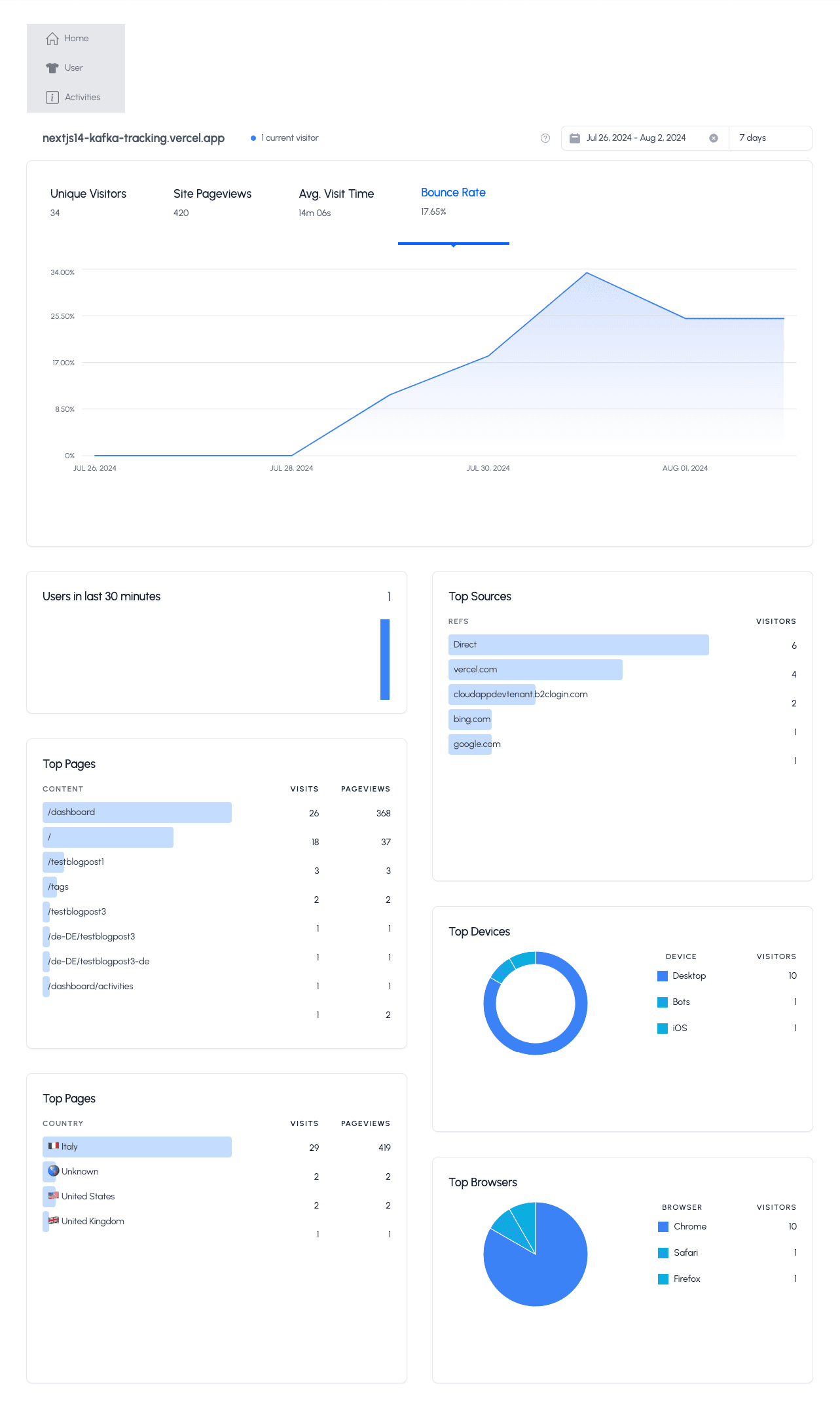
}And here is the final result with the new widgets
Now, we can use the tabs in the top KPI widget. The colors of the PIE and DONUT charts are correct, and we can easily switch/change the date range.
Cloudapp-dev, and before you leave us
Thank you for reading until the end. Before you go: