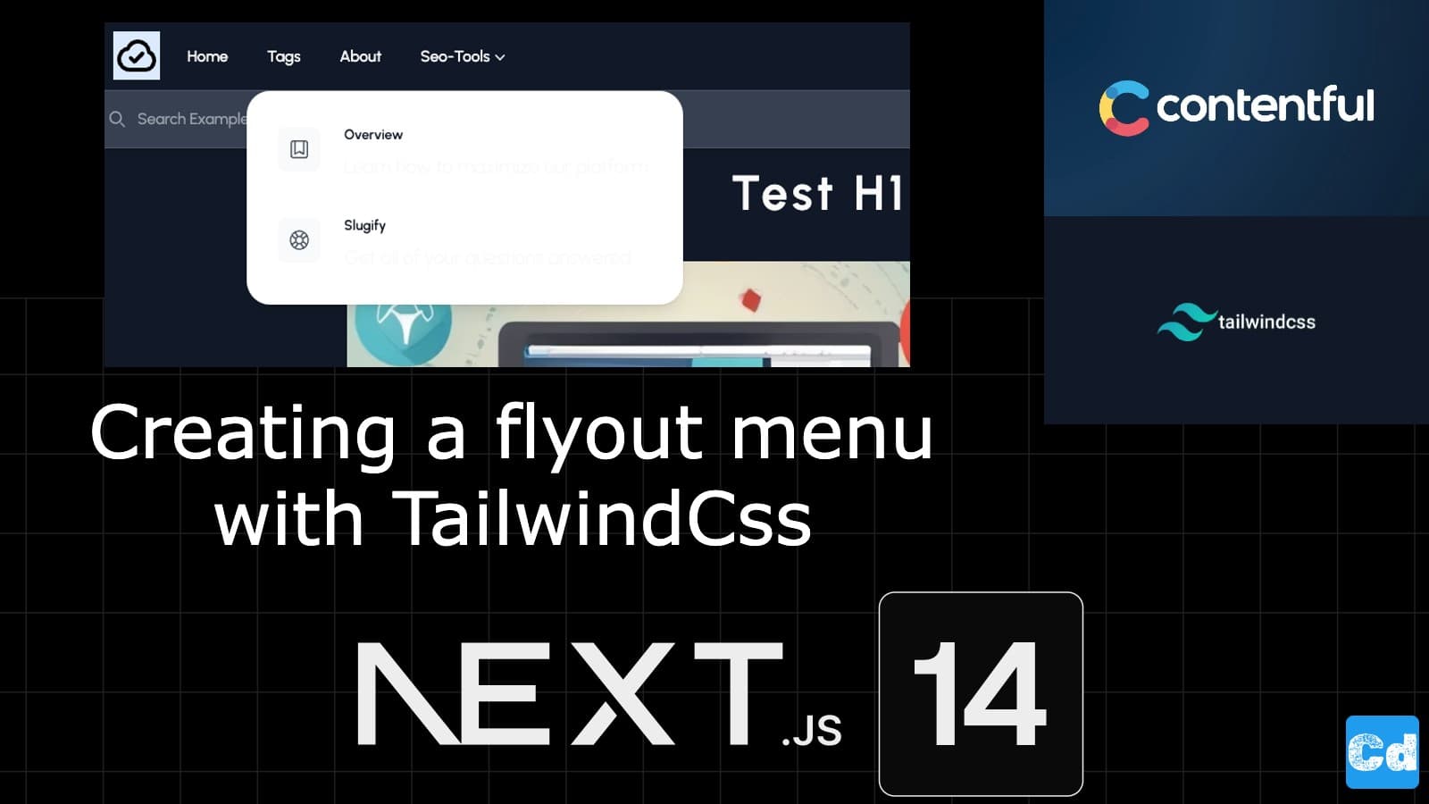
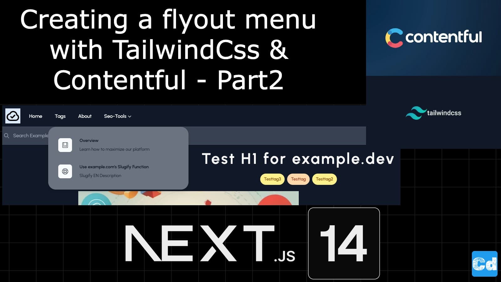
In the previous story, we created the components for the flyout menu and did the basic integration, but the displayed data came from a static variable. Now, we will connect the menu with our headless CMS Contentful.
Here is the GitHub repo with the entire code. Below, you will find the link to the example page.
Example page hosted on Vercel -> https://nextjs14-contentful-syntax-highlighting.vercel.app/
Used Stack
I will start with my default stack:
Next.js 14 as the web framework, and I will use the provided middleware edge function
TailwindCss for Styling
Contentful CMS (Free Plan)
Vercel for hosting
Extending Contentmodel in Contentful
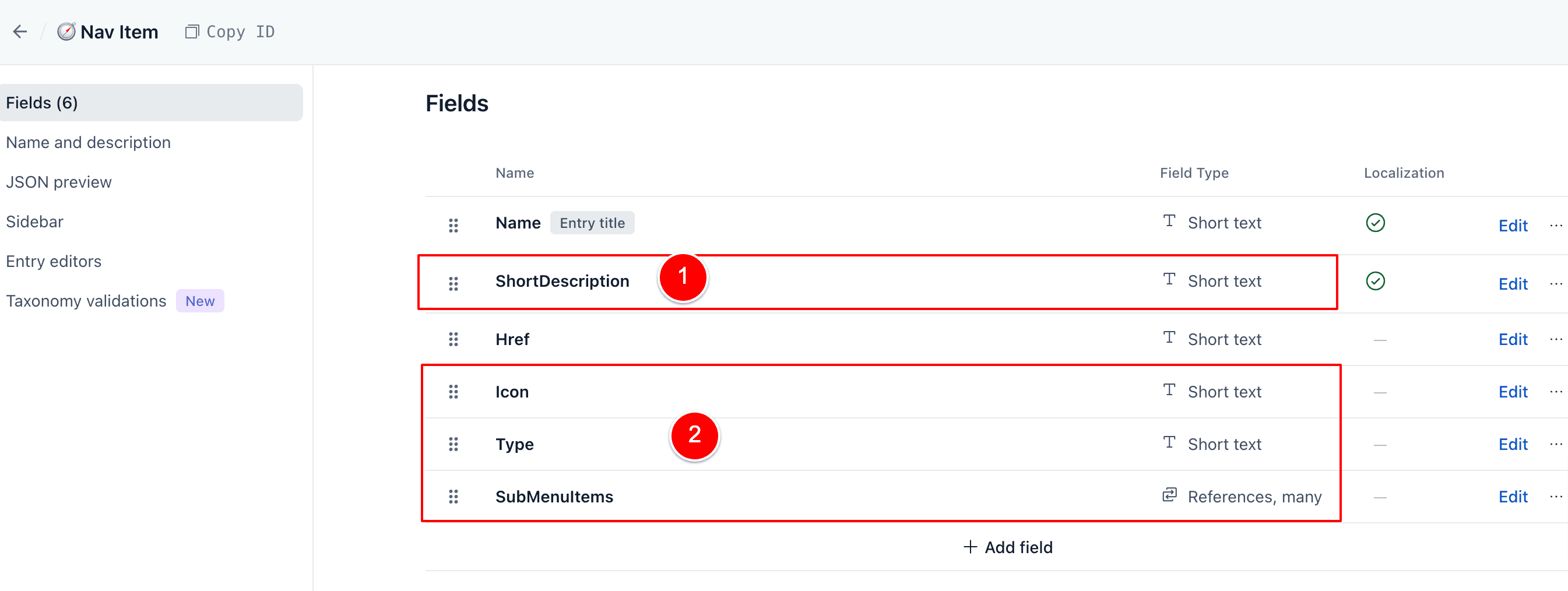
Before starting the coding, we must adapt the existing content model for the content type “NavItem” in Contentful. We will add 4 new attributes.
ShortDescription — Self-explaining
Icon — for the Icon shown in front of the menu point in the flyout
Type — Menu or Submenu so that we can handle it in the code
SubMenuItems — To link the submenu items
Modifying Graphql-Query for “NavItems”
We add the 4 new fields in the file src/lib/graphql/navItemFields.graphql
fragment NavItemFields on NavItem {
  __typename
  sys {
    id
  }
  name
  shortDescription
  href
  type
  icon
  subMenuItemsCollection {
    items {
      name
      shortDescription
      href
      type
      icon
    }
  }
}
, and then we execute
npm run graphql-codegen:generateto update the corresponding files like sdk.ts, graphql.schema.graphql, and graphql.schema.json
Connecting the menu with Contentful
Now, we are ready for the connection. Let’s adapt the component file src/components/header/navbar.components.tsx
//Line 39 we adapt the inteface
interface Linkitems {
  key: number;
  name: string;
  shortDescription?: string;
  href: string;
  icon?: any;
  submenutitems?: any;
  breakpoint?: string;
}
New Function for the submenu
function SubMenu({
    href,
    name,
    shortDescription,
    submenutitems,
    breakpoint,
  }: Linkitems) {
    return (
      <Popover className="relative">
        <Popover.Button className="border-transparent text-gray-500 dark:text-gray-50 hover:border-gray-300 hover:text-gray-700 inline-flex items-center text-base px-1 pt-1 border-b-2 font-medium">
          {breakpoint === "desktop" ? (
            <>
              <span>{name}</span>
              <ChevronDownIcon className="w-5 h-5" aria-hidden="true" />
            </>
          ) : (
            <div className="pl-3 flex">
              <span>{name}</span>
              <ChevronDownIcon className="ml-2 w-5 h-5" aria-hidden="true" />
            </div>
          )}
        </Popover.Button>

        <Popover.Panel className="absolute left-1/2 z-10 mt-5 flex w-screen max-w-max -translate-x-1/2 px-4 transition data-[closed]:translate-y-1 data-[closed]:opacity-0 data-[enter]:duration-200 data-[leave]:duration-150 data-[enter]:ease-out data-[leave]:ease-in">
          <div className="flex-auto w-screen max-w-md overflow-hidden text-sm leading-6 bg-white dark:bg-gray-500 shadow-lg rounded-3xl ring-1 ring-gray-900/5">
            <div className="p-4">
              {submenutitems.map((item: Linkitems) => (
                <div
                  key={item.name}
                  className="relative flex p-4 rounded-lg group gap-x-6 hover:bg-gray-50"
                >
                  <div className="flex items-center justify-center flex-none mt-1 rounded-lg h-11 w-11 bg-gray-50 group-hover:bg-white">
                    {item.icon === "BookmarkSquareIcon" ? (
                      <BookmarkSquareIcon
                        className="w-6 h-6 text-gray-600 group-hover:text-indigo-600"
                        aria-hidden="true"
                      />
                    ) : (
                      <LifebuoyIcon
                        className="w-6 h-6 text-gray-600 group-hover:text-indigo-600"
                        aria-hidden="true"
                      />
                    )}
                  </div>
                  <div>
                    <a href={item.href} className="font-semibold text-gray-900">
                      {item.name}
                      <span className="absolute inset-0" />
                    </a>
                    <div className="mt-1 text-gray-800">
                      {item.shortDescription}
                    </div>
                  </div>
                </div>
              ))}
            </div>
          </div>
        </Popover.Panel>
      </Popover>
    );
  }
Changes on Desktop View and Mobile View
Desktop View — We use a condition based on the type
       {/* Desktop View */}
              {menuItems.map((menuItem: any, index: number) =>
                menuItem.type === "Menu" ? (
                  <NavigationLink
                    key={index}
                    href={`/${locale}${menuItem.href}`}
                    name={menuItem.name}
                  />
                ) : (
                  <SubMenu
                    key={index}
                    href={`/${locale}${menuItem.href}`}
                    name={menuItem.name}
                    submenutitems={menuItem.subMenuItemsCollection.items}
                    breakpoint="desktop"
                  />
                )
              )}
Mobile View — Here, we use a condition based on the type as well
   {/* Only show up in Mobile view */}
              {menuItems.map((menuItem: any, index: number) =>
                menuItem.type === "Menu" ? (
                  <NavigationLinkDisclosure
                    key={index}
                    href={`/${locale}${menuItem.href}`}
                    name={menuItem.name}
                  />
                ) : (
                  <SubMenu
                    key={index}
                    href={`/${locale}${menuItem.href}`}
                    name={menuItem.name}
                    submenutitems={menuItem.subMenuItemsCollection.items}
                    breakpoint="mobile"
                  />
                )
              )}
Final Result
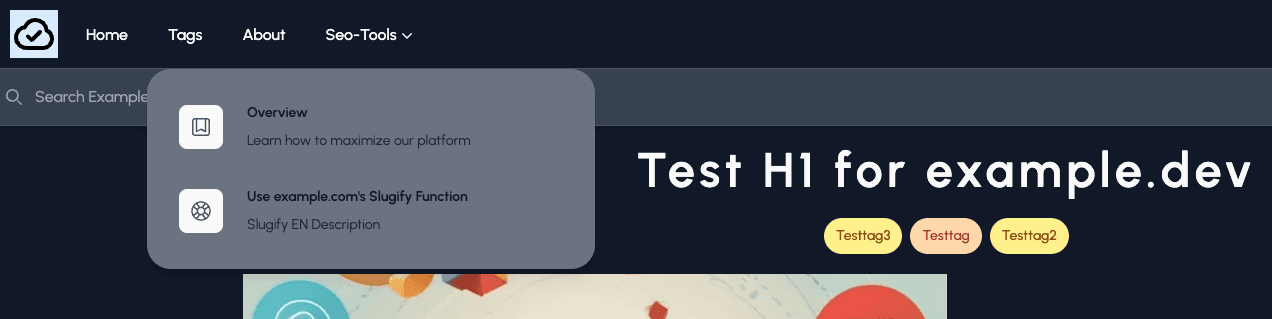
Below is the flyout menu, which gets the data from Contentful and is optimized for the desktop and mobile breakpoint.
Cloudapp-dev, and before you leave us
Thank you for reading until the end. Before you go: