Table of Contents
- Why Shiki?
- Used Stack
- Inspiration and initial source
- Two new NPM Packages
- New Component for Syntax Highlighting
- Component Integration into the page.tsx
- Let’s make it nice
- Passing Props in Page.tsx
- First nice, now we enhance it
- Highlighting Specific Lines
- Adapting code Prop on Page.tsx
- Showing Code Changes
- New Classes “diff remove” and “diff add”
- Including Filenames and additional styling
- Integration of Line Numbers with TailwindCss
- Styling Highlights and Diffs
- Adapting post.config.js
- Final Result
- Cloudapp-dev, and before you leave us
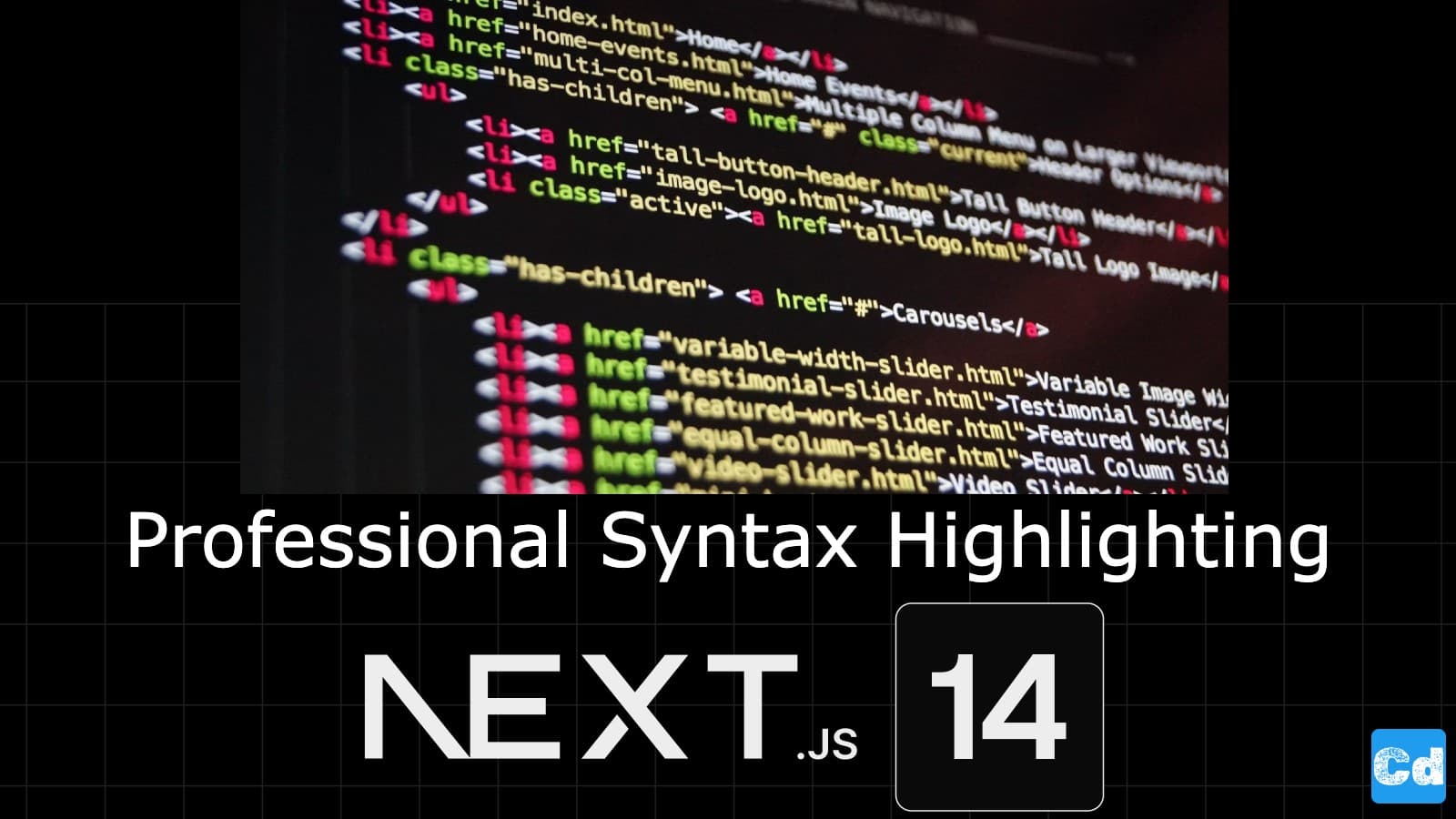
You can use different approaches to integrate code blocks on your blog or website (TailwindCSS, etc.). I came across a modern approach to syntax highlighting and discovered Shiki, a relatively new syntax highlighter developed by Pine Wu and maintained by Anthony Fu. Significant companies like Vercel utilize Shiki for their Next.js documentation and Astro for syntax highlighting.
Here is the GitHub repo with the entire code. Below, you will find the link to the example page.
Example page hosted on Vercel -> https://nextjs14-contentful-syntax-highlighting.vercel.app/
Why Shiki?
Syntax highlighting in Next.js apps can be a smart move. Shiki is based on TextMate grammar, the same system used by Visual Studio Code, ensuring accurate and visually appealing code highlighting. More importantly, for the performance of our website, Shiki renders highlighted code ahead of time. This means no extra JavaScript is shipped to the client for syntax highlighting, aligning with Next.js's push for server components and minimal client-side JavaScript.
Used Stack
I will start with my default stack:
Next.js 14 as the web framework, and I will use the provided middleware edge function
NPM Package Shiki for syntax highlighting and the corresponding transformers package
Vercel for hosting
Inspiration and initial source
Thanks to Nikolai Lehbrink for the inspiration and the initial code source, which I used to integrate into my Next.js 14 project. If you are interested in a detailed how-to regarding the integration in Next.js 13 -> https://www.nikolailehbr.ink/blog/syntax-highlighting-shiki-next-js
Two new NPM Packages
npm install shiki
npm install @shikijs/transformers
New Component for Syntax Highlighting
Now, I will create a new component to reuse in the home.
//src/components/tools/syntaxhighlight/syntaxhighlight.component.tsx
import { codeToHtml } from "shiki";

export default async function SyntaxHighlight() {
  const html = await codeToHtml("const a = 1 + 3", {
    lang: "javascript",
    theme: "nord",
  });

  return <div dangerouslySetInnerHTML={{ __html: html }}></div>;
}
Component Integration into the page.tsx
Below is the integration into the page.tsx
//src/app/[locale]/page.tsx
import SyntaxHighlight from "@/components/tools/syntaxhighlight/syntaxhighlight.component";

export default function Home() {
  return (
    <>
      <SyntaxHighlight />
    </>
  );
}
Let’s make it nice
Right now, everything is hard-coded, so let’s extend our component to take the code, the language (lang) and the theme as props.
import { codeToHtml } from "shiki";
import type { BundledLanguage, BundledTheme } from "shiki";

type Props = {
  code: string;
  lang?: BundledLanguage;
  theme?: BundledTheme;
};

export default async function SyntaxHighlight({
  code,
  lang = "javascript",
  theme = "nord",
}: Props) {

  const html = await codeToHtml(code, {
    lang,
    theme,
  });

  return (
    <div
      dangerouslySetInnerHTML={{ __html: html }}
    ></div>
  );
}
Passing Props in Page.tsx
//src/app/[locale]/page.tsx
import SyntaxHighlight from "@/components/tools/syntaxhighlight/syntaxhighlight.component";

export default function Home() {
  return (
    <>
      <SyntaxHighlight code="let a = 1 + 4" />
      <SyntaxHighlight code="console.log('Hello, world!')" lang="typescript" />
      <SyntaxHighlight
        code={`fn main() { println!(\"Hello, world!\"); }`}
        lang="rust"
        theme="github-dark"
      />
    </>
  );
}
First nice, now we enhance it
The basic functionality is done. Let’s add some enhancements to our code block.
Highlighting Specific Lines
I didn’t want to miss out on the implementation of line highlighting. Shiki has a few transformers That let us quickly set this up.
I have already installed the transformers package and the base Shiki package.
New Import on line 3
“import {transformerNotationHighlight } from @shikijs/transformers;”
Transformers activation below “lang” and “theme”
transformers: [transformerNotationHighlight()],
//syntaxhighlight Component
import { codeToHtml } from "shiki";
import type { BundledLanguage, BundledTheme } from "shiki";
import {
    transformerNotationHighlight,
  } from "@shikijs/transformers";

type Props = {
  code: string;
  lang?: BundledLanguage;
  theme?: BundledTheme;
};

export default async function SyntaxHighlight({
  code,
  lang = "javascript",
  theme = "nord",
}: Props) {
  const html = await codeToHtml(code, {
    lang,
    theme,
    transformers: [transformerNotationHighlight()],
  });

  return <div
    className="[&_.highlighted]:bg-blue-500"
    dangerouslySetInnerHTML={{ __html: html }}>
  </div>;
}
Adapting code Prop on Page.tsx
I added this part “ // [!code highlight]” at the end of the “code” line.
<SyntaxHighlight
   code={`fn main() { println!(\"Hello, world!\"); }`}
   lang="rust"
   theme="github-dark"
/>
This adds the “has-highlighted” class to the <pre> and the “highlighted” class to the <span>. Now, I target the class with CSS and style it accordingly. I will use TailwindCSS (with its arbitrary values).
<div className="[&_.highlighted]:bg-blue-500"
    dangerouslySetInnerHTML={{ __html: html }}>
</div>
Showing Code Changes
To add classes for added and removed lines, we follow the same steps as above, but with a different transformer called transformerNotationDiff. First, imported the new transformer, and then I add the // [!code ++] comment for added lines and a respective // [!code --] comment for removed lines to your code prop.
import { codeToHtml } from "shiki";
import type { BundledLanguage, BundledTheme } from "shiki";
import {
  transformerNotationHighlight,
  transformerNotationDiff,
} from "@shikijs/transformers";
import CopyToClipboard from "./copyToClipboard.component";

type Props = {
  code: string;
  lang?: BundledLanguage;
  theme?: BundledTheme;
};

export default async function SyntaxHighlight({
  code,
  lang = "javascript",
  theme = "nord",
  filename,
}: Props) {
  const html = await codeToHtml(code, {
    lang,
    theme,
    transformers: [transformerNotationHighlight(), transformerNotationDiff()],
  });

  return (
         <div
          className="border-t-2 border-neutral-700 text-sm [&>pre]:overflow-x-auto [&>pre]:!bg-neutral-900 [&>pre]:py-3 [&>pre]:pl-4 [&>pre]:pr-5 [&>pre]:leading-snug [&_code]:block [&_code]:w-fit [&_code]:min-w-full"
          dangerouslySetInnerHTML={{ __html: html }}
        ></div>
  );
}    <SyntaxHighlight
          code="console.log('Hello, world!')"
          lang="typescript"
    />
    <SyntaxHighlight
          code="console.log('Hello, world!')"
          lang="typescript"
    />
New Classes “diff remove” and “diff add”
This again adds thediff removediff add<pre class="shiki nord has-diff" style="background-color:#2e3440ff;color:#d8dee9ff" tabindex="0">
<code>
<span class="line diff remove">...</span>
<span class="line diff add">...</span>
</code>
</pre>Including Filenames and additional styling
Besides the highlighting, I wanted to add filenames to my code components. That way, the reader always knows to which file the given code belongs.
So, let’s add afilenameimport { codeToHtml } from "shiki";
import type { BundledLanguage, BundledTheme } from "shiki";
import {
transformerNotationHighlight,
transformerNotationDiff,
} from "@shikijs/transformers";
import CopyToClipboard from "./copyToClipboard.component";
type Props = {
code: string;
lang?: BundledLanguage;
theme?: BundledTheme;
filename?: string;
};
export default async function SyntaxHighlight({
code,
lang = "javascript",
theme = "nord",
filename,
}: Props) {
const html = await codeToHtml(code, {
lang,
theme,
transformers: [transformerNotationHighlight(), transformerNotationDiff()],
});
return (
<div className="mt-4 rounded-lg bg-gradient-to-r from-sky-200 to-sky-400 p-4 !pr-0 md:p-8 lg:p-12 [&>pre]:rounded-none max-w-4xl">
<div className="overflow-hidden rounded-s-lg">
<div className="flex items-center justify-between bg-gradient-to-r from-neutral-900 to-neutral-800 py-2 pl-2 pr-4 text-sm">
<span className="-mb-[calc(0.5rem+2px)] rounded-t-lg border-2 border-white/5 border-b-neutral-700 bg-neutral-800 px-4 py-2 ">
{filename}
</span>
<CopyToClipboard code={code} />
</div>
<div
className="border-t-2 border-neutral-700 text-sm [&>pre]:overflow-x-auto [&>pre]:!bg-neutral-900 [&>pre]:py-3 [&>pre]:pl-4 [&>pre]:pr-5 [&>pre]:leading-snug [&_code]:block [&_code]:w-fit [&_code]:min-w-full"
dangerouslySetInnerHTML={{ __html: html }}
></div>
</div>
</div>
);
}page.tsxfilename<Code code="let a = 1 + 4" filename="index.js" />
Integration of Line Numbers with TailwindCss
One common thing to integrate in a code block are line numbers, making the component visually more appealing while also giving the reader a reference for specific lines in the code.
Styling Highlights and Diffs
In order to enhance the design of the individual highlighted lines, I added the following styles as well.
//app/global.css
.shiki {
  counter-reset: step;
  counter-increment: step 0;
  .line {
    @apply border-l-4 border-transparent;
    &::before {
      counter-increment: step;
      @apply mr-6 inline-block w-4 border-transparent text-right text-neutral-600 content-[counter(step)];
    }
    &.highlighted,
    &.diff {
      @apply -ml-4 -mr-5 inline-block w-[calc(100%+(theme(spacing.5)+theme(spacing.4)))] pl-4 pr-5;
    }
    &.highlighted {
      @apply border-neutral-500 bg-neutral-800;
    }
    &.diff {
      &.add,
      &.remove {
        span:first-child::before {
          @apply -ml-4 inline-flex w-4;
        }
      }
      &.add {
        @apply border-blue-500 bg-blue-500/25 before:text-blue-500;
        span:first-child::before {
          @apply text-blue-500 content-["+"];
        }
      }
      &.remove {
        @apply border-orange-500 bg-orange-500/30 opacity-70 *:!text-neutral-400 before:text-orange-500;
        span:first-child::before {
          @apply text-orange-500 content-["-"];
        }
      }
    }
  }
}
Adapting post.config.js
You don’t have to install the plugin, as it is packed with TailwindCSS, which was already installed.
//post.config.js
module.exports = {
  plugins: {
    "tailwindcss/nesting": {},
    tailwindcss: {},
    autoprefixer: {},
  },
};
Final Result
Lastly, I added some styles to make the whole syntax highlight component more visually appealing and added a background gradient. I added a copy-to-clipboard function as well. You will find the complete code at the top of this story on the provided link.
return (
    <div className="mt-4 rounded-lg bg-gradient-to-r from-sky-200 to-sky-400 p-4 !pr-0 md:p-8 lg:p-12 [&>pre]:rounded-none max-w-4xl">
      <div className="overflow-hidden rounded-s-lg">
        <div className="flex items-center justify-between bg-gradient-to-r from-neutral-900 to-neutral-800 py-2 pl-2 pr-4 text-sm">
          <span className="-mb-[calc(0.5rem+2px)] rounded-t-lg border-2 border-white/5 border-b-neutral-700 bg-neutral-800 px-4 py-2 ">
            {filename}
          </span>
          <CopyToClipboard code={code} />
        </div>
        <div
          className="border-t-2 border-neutral-700 text-sm [&>pre]:overflow-x-auto [&>pre]:!bg-neutral-900 [&>pre]:py-3 [&>pre]:pl-4 [&>pre]:pr-5 [&>pre]:leading-snug [&_code]:block [&_code]:w-fit [&_code]:min-w-full"
          dangerouslySetInnerHTML={{ __html: html }}
        ></div>
      </div>
    </div>
  );
Cloudapp-dev, and before you leave us
Thank you for reading until the end. Before you go: