Table of Contents
- New Content Types - Graphql Files
- Videotutorial creation Navitem Content Type
- Videotutorial creation NavItemGroup Content Type
- Videotutorial creation FooterItemGroup Content Type
- New NPM Packages
- Deeper Look in the Code
- List of all changed & added files
- Changes at tailwind.config.ts
- Enabling Contentful Draft Mode - Preview
- Configuration Content Preview Contentful
- GitHub Repo
In Part 1 we created the foundation of our Next.js 14 project. In Part 2 we created the frontend with Contentful as headless CMS, Tailwindcss for styling, and Typescript for the coding. Now we have reached part 3 and we will add a header and a footer component, as well as the so-called draft/preview functionality offered by Contentful. Not to forget the nowadays mandatory dark mode toggle. Here is already a spoiler to the final result -> Create Cloudapp.dev Example App
New Content Types - Graphql Files
We start with the creation of our new Content Types: Nav Item NavitemGroup FooterItemGroup

Since we have new Content-Types we must create the corresponding graphql-files under src/lib/graphql
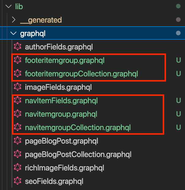
With the new graphql-files in place we can launch the sync command
npm run graphql-codegen:generateWhich updates three files in the folder src/lib/__generated
sdk.ts graphql.schema.json graphql.schema.graphql
Let’s take a look at navItemFields.graphql. As you can see in the screenshot below, we have two fields in the Content-Type “Nav Item” and these two fields are represented in the graphql file.
fragment NavItemFields on NavItem {
  name
  href
}
Videotutorial creation Navitem Content Type
We reuse this fragment in the other files (navitemgroup.graphql)
fragment NavItemGroupFields on NavItemGroup {
  __typename
  sys {
    id
    spaceId
  }
  name
  navItemsCollection {
    __typename
    items {
      ...NavItemFields
    }
  }
}
query navItemGroup($locale: String, $preview: Boolean) {
  navItemGroupCollection(
    limit: 1
    locale: $locale
    preview: $preview
    where: { mainNav: "Yes" }
  ) {
    items {
      ...NavItemGroupFields
    }
  }
}
Videotutorial creation NavItemGroup Content Type
Videotutorial creation FooterItemGroup Content Type
New NPM Packages
Now we are ready for the installation of three new NPM packages
npm install @headlessui/react @heroicons/react next-themesWe can now add the new components
import Navbar from "@/components/header/navbar.component";
export default function Header({ menuItems }: any) {
  return (
    <header>
      {/* <DarkModeButton /> */}
      {/* <NavbarBanner /> */}
      <Navbar menuItems={menuItems} />
    </header>
  );
}
In the header.component.tsx we receive the “menuItems” as props from layout.tsx and then we send them to the component “Navbar”.
Deeper Look in the Code
Let’s do a short deep dive into layout.tsx (src/app/layout.tsx)
import type { Metadata } from "next";
import { Urbanist } from "next/font/google";
import { draftMode } from "next/headers";
import "./globals.css";
import Header from "@/components/header/header.component";
import Footer from "@/components/footer/footer.component";
import { Providers } from "@/components/header/providers";
import getAllNavitemsForHome from "@/components/header/navbar.menuitems.component";
import getAllFooteritemsForHome from "@/components/footer/footer.menuitems.component";
import ExitDraftModeLink from "@/components/header/draftmode/ExitDraftModeLink.component";
const urbanist = Urbanist({ subsets: ["latin"], variable: "--font-urbanist" });
export const metadata: Metadata = {
title: "Create Cloudapp.dev Example App",
description: "Generated by create next app",
};
export default async function RootLayout({
children,
}: {
children: React.ReactNode;
}) {
const headerdata = await getAllNavitemsForHome();
const footerdata = await getAllFooteritemsForHome();
return (
<html lang="en" suppressHydrationWarning>
<body>
<main className={`${urbanist.variable} font-sans dark:bg-gray-900`}>
<Providers>
<Header menuItems={headerdata} />
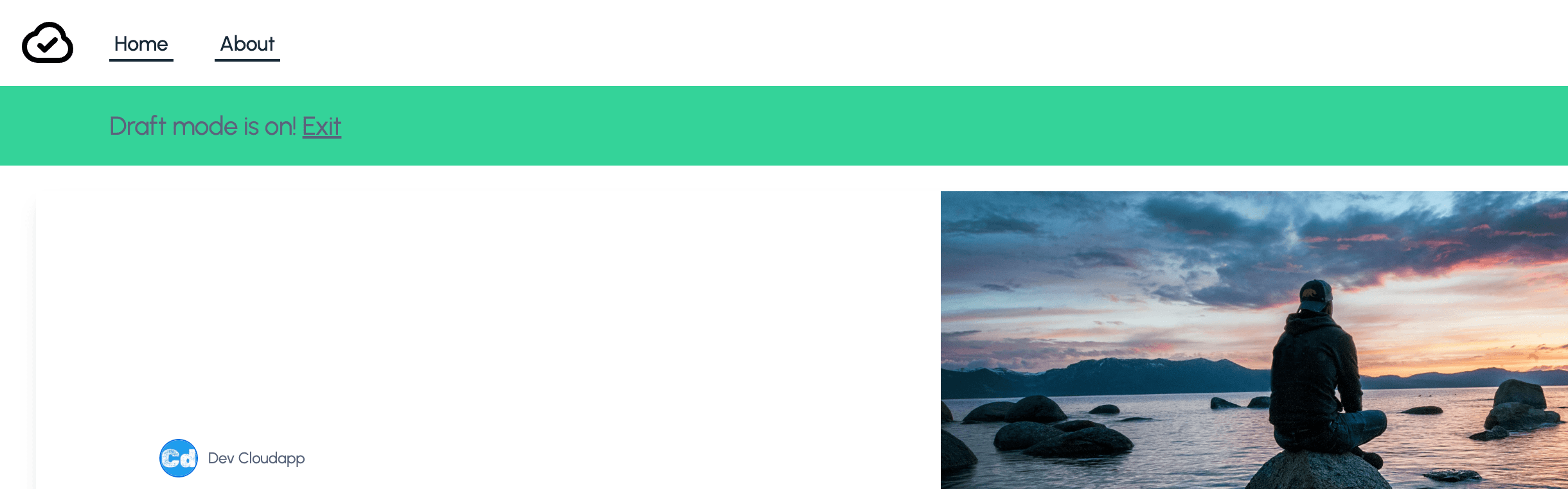
{draftMode().isEnabled && (
<p className="bg-emerald-400 py-4 px-[6vw]">
Draft mode is on! <ExitDraftModeLink className="underline" />
</p>
)}
{children}
<Footer footerItems={footerdata} />
</Providers>
</main>
</body>
</html>
);
} On the top, we import these components for the new parts
import Header from "@/components/header/header.component";
import Footer from "@/components/footer/footer.component";
import { Providers } from "@/components/header/providers";
import getAllNavitemsForHome from "@/components/header/navbar.menuitems.component";
import getAllFooteritemsForHome from "@/components/footer/footer.menuitems.component";
and the “Providers” component for the dark mode handling.
"use client";
import { ThemeProvider } from "next-themes";
export function Providers({ children }: { children: React.ReactNode }) {
  return (
    <ThemeProvider enableSystem={true} attribute="class">
      {children}
    </ThemeProvider>
  );
}
Below I point out the return part of the src/app/layout.tsx, where we can see, that we wrapped the header, footer, and {children} into the <Providers></Providers> component, which allows us to use the dark mode toggle on every page.
return (
    <html lang="en" suppressHydrationWarning>
      <body>
        <main className={`${urbanist.variable} font-sans dark:bg-gray-900`}>
          <Providers>
            <Header menuItems={headerdata} />
            {children}
            <Footer footerItems={footerdata} />
          </Providers>
        </main>
      </body>
    </html>
  );
Under {Providers} we import the data for Header/Footer.
import getAllNavitemsForHome from "@/components/header/navbar.menuitems.component";
import getAllFooteritemsForHome from "@/components/footer/footer.menuitems.component";
getAllNavitemsForHome in Detail
import { client } from "@/lib/client";
import { draftMode } from "next/headers";
async function getMenuItems() {
  const { isEnabled } = draftMode();
  const entries = await client.navItemGroup({
    preview: isEnabled,
  });
  return extractNavItemEntries(entries) || [];
}
function extractNavItemEntries(fetchResponse: any) {
  return fetchResponse?.navItemGroupCollection?.items?.[0].navItemsCollection
    ?.items;
}
export default async function getAllNavitemsForHome() {
  const navitems = await getMenuItems();
  return navitems || [];
}
which fetches the data via graphql query from Contentful. client.navItemGroup uses the graphql query specified in src/lib/graphql/navitemgroup.graphql
fragment NavItemGroupFields on NavItemGroup {
  __typename
  sys {
    id
    spaceId
  }
  name
  navItemsCollection {
    __typename
    items {
      ...NavItemFields
    }
  }
}
query navItemGroup($locale: String, $preview: Boolean) {
  navItemGroupCollection(
    limit: 1
    locale: $locale
    preview: $preview
    where: { mainNav: "Yes" }
  ) {
    items {
      ...NavItemGroupFields
    }
  }
}
Because we reuse the same nav items in the header and the footer we defined them only once in graphql.
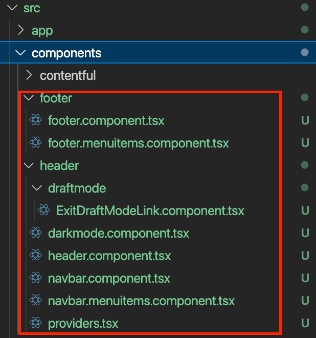
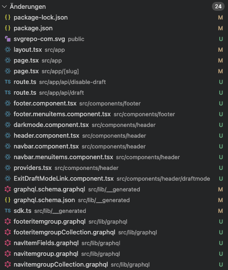
List of all changed & added files
Here is a complete list of all changed/added files in Part 3 of the tutorial. All files in the folder src/lib/__generated are generated by the command “npm run graphql-codegen:generate” mentioned at the beginning.
Changes at tailwind.config.ts
The tailwind.config.ts had a small modification as well. We added line 4 and line 27
# Line 4
const extraColors = require("tailwindcss/colors"); //for extra colors e.g. in the Arctile TOC -> emerald
# Line 27
colors: { emerald: extraColors.emerald },import type { Config } from "tailwindcss";
import tokens from "@contentful/f36-tokens";
const { fontFamily } = require("tailwindcss/defaultTheme");
const extraColors = require("tailwindcss/colors"); //for extra colors e.g. in the Arctile TOC -> emerald
const colors = Object.entries(tokens).reduce(
(acc: Record<string, any>, [key, value]) => {
// Filter Hex colors from the f36-tokens
if (/^#[0-9A-F]{6}$/i.test(value as any)) {
acc[key] = value;
}
return acc;
},
{} as Record<string, string>
);
const config: Config = {
darkMode: "class",
content: [
"./src/components/**/*.{js,ts,jsx,tsx,mdx}",
"./src/app/**/*.{js,ts,jsx,tsx,mdx}",
],
theme: {
colors,
extend: {
colors: { emerald: extraColors.emerald },
maxWidth: {
"8xl": "90rem",
},
letterSpacing: {
snug: "-0.011em",
},
boxShadow: {
// light
"tremor-input": "0 1px 2px 0 rgb(0 0 0 / 0.05)",
"tremor-card":
"0 1px 3px 0 rgb(0 0 0 / 0.1), 0 1px 2px -1px rgb(0 0 0 / 0.1)",
"tremor-dropdown":
"0 4px 6px -1px rgb(0 0 0 / 0.1), 0 2px 4px -2px rgb(0 0 0 / 0.1)",
},
borderRadius: {
"tremor-small": "0.375rem",
"tremor-default": "0.5rem",
"tremor-full": "9999px",
},
fontSize: {
"2xs": "0.625rem",
"3xl": "1.75rem",
"4xl": "2.5rem",
"tremor-label": "0.75rem",
"tremor-default": ["1.0rem", { lineHeight: "1.25rem" }],
"tremor-title": ["1.125rem", { lineHeight: "1.75rem" }],
"tremor-metric": ["1.875rem", { lineHeight: "2.25rem" }],
},
lineHeight: {
tighter: "1.1",
},
fontFamily: {
sans: ["var(--font-urbanist)", ...fontFamily.sans],
},
},
},
plugins: [require("@tailwindcss/typography")],
};
export default config;With this change, we added the extra color “emerald”, which we used on line 34 (layout.tsx), within our draft mode banner
Enabling Contentful Draft Mode - Preview
{draftMode().isEnabled && (
   <p className="bg-emerald-400 py-4 px-[6vw]">
     Draft mode is on! <ExitDraftModeLink className="underline" />
   </p>
 )}
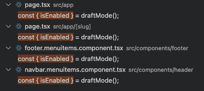
To enable draft/preview mode we modified these pages and components
and we added these two routes

I added this import
import { draftMode } from "next/headers";and this constant and I reused the const for the graphql-query (example shows a code piece of src/app/page.tsx
sync function BlogPostPage() {
  const { isEnabled } = draftMode();

  const [blogPagedata] = await Promise.all([
    client.pageBlogPost({
      slug: "testblogpost",
      preview: isEnabled,
    }),
  ]);
above I used “client.pageBlogPost” with two params “slug” and “preview”. Slug for filtering (slug is defined as a unique field in Contentful), while preview is used to get the data for content records in “draft” status, which we need for the preview.
query pageBlogPost($slug: String!, $locale: String, $preview: Boolean) {
  pageBlogPostCollection(
    limit: 1
    where: { slug: $slug }
    locale: $locale
    preview: $preview
  ) {
    items {
      ...PageBlogPostFields
    }
  }
}
Configuration Content Preview Contentful
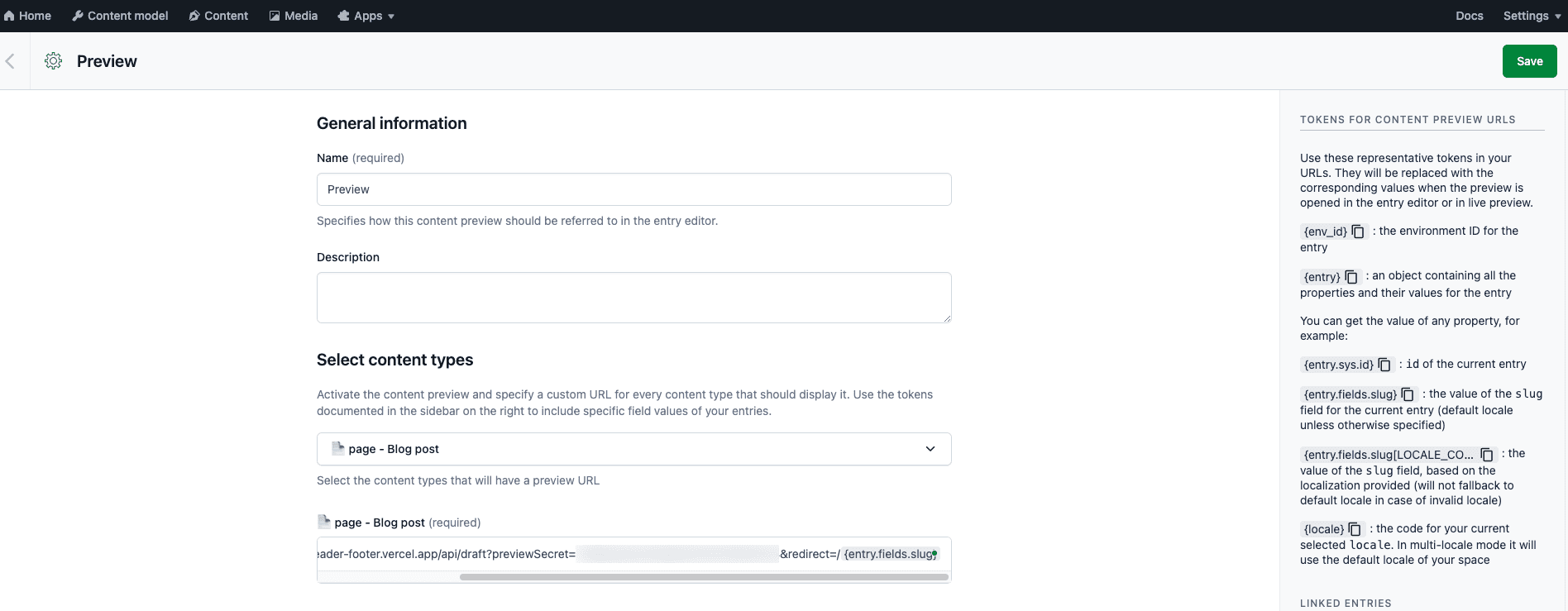
As a last step, we set up the “Content Preview” within Contentful.
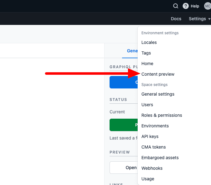
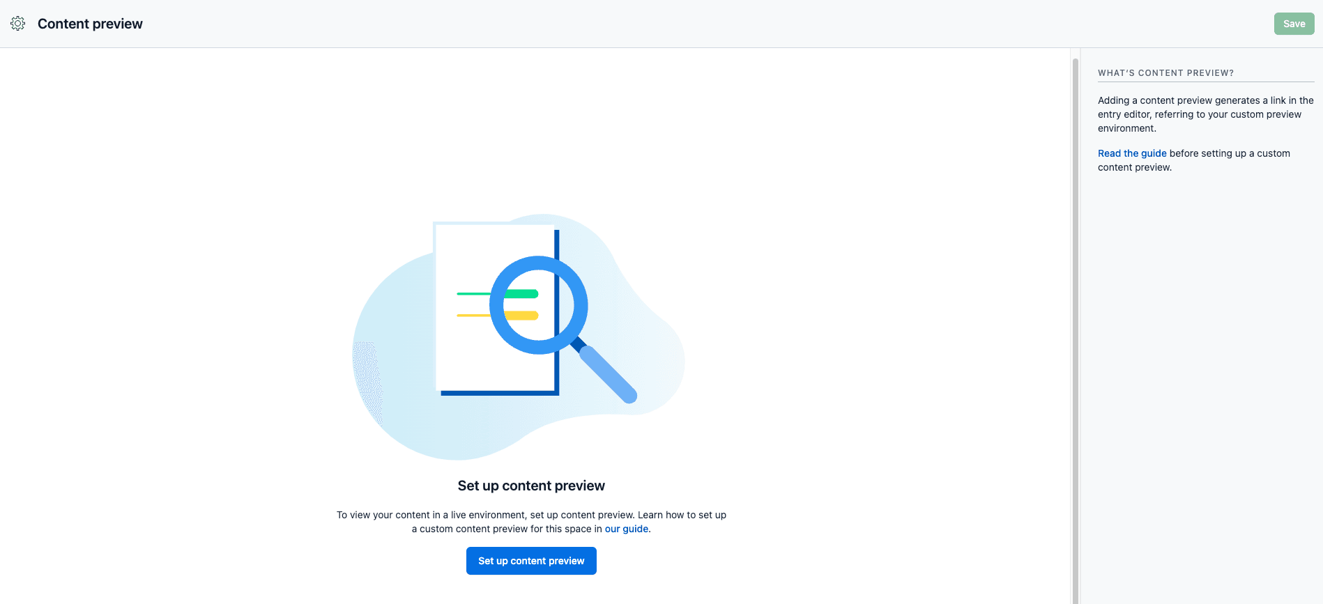
We have to define three fields:
Name -> I used “Preview”
Select content types -> I selected “page — Blog post”
Url -> https://nextjs14-full-example-header-footer.vercel.app/api/draft?previewSecret=xxxxxxxxxxxxxx&redirect=/{entry.fields.slug} (use the value from the env variable -> CONTENTFUL_PREVIEW_SECRET)
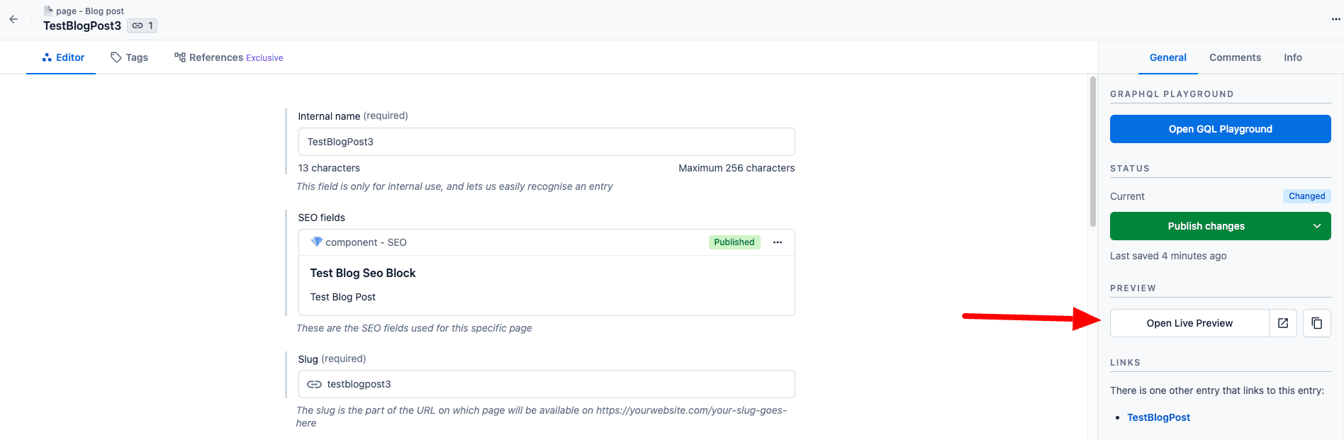
Now let’s open “TestBlogPost3” in Contentful and click on the button “Open Live Preview” on the right side.
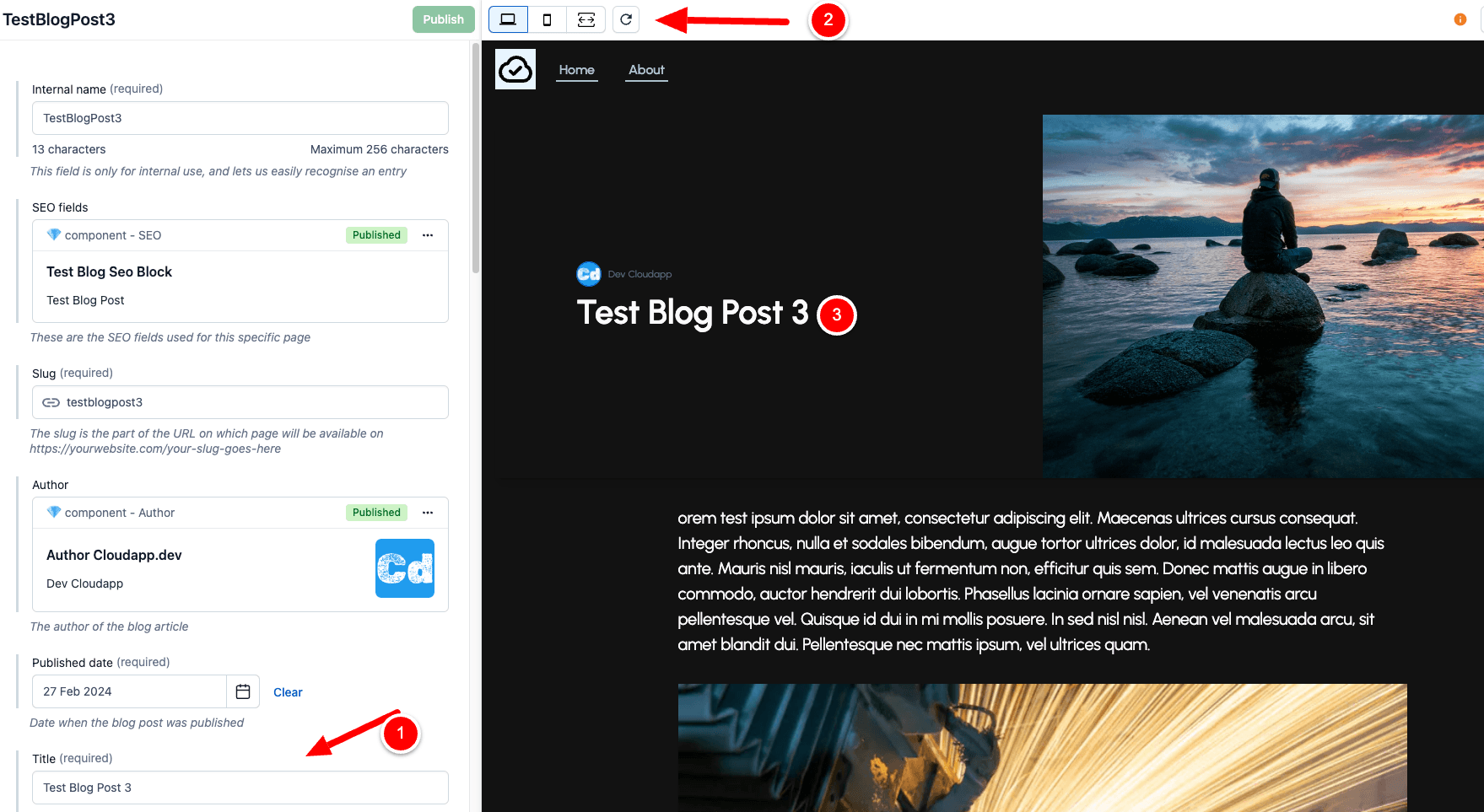
And here is the preview (to test it, modify the Title field on the left side (1) and then click on refresh (2) and you will see the draft mode banner and the change (3))
GitHub Repo
Here is the full code in the corresponding GitHub branch -> GitHub - cloudapp-dev/nextjs14-typescript-app-router-contentful at nextjs14-part3
where you also find the updated export.json file (folder “contentfulsync”), which you can use to import the data to contentful
npm run cf-importStay tuned for the next posts where we will add new functions like an Azure Entra ID (formerly Azure AD B2C) for identity management Algolia as an On-Site Search Engine and a lot more.
If you like what you see, then please support me with a clap or follow me on medium.com.