
Inhaltsverzeichnis
- Verwendeter Stack
- Neue und aktualisierte NPM Pakete
- Neue Header Komponente für die Dashboard Seite
- Neue Komponenten für unsere neuen Widgets
- TopDeviceWidget
- TopLocationsWidget
- TopSourceWidget
- TrendWidget
- Upgrade auf tremor/react 3.1
- Neues Styling für das Dashboard
- Vollständige tailwind.config.ts
- Global.css
- Und hier ist das Endergebnis mit den neuen Widgets
- Cloudapp-dev und bevor Sie uns verlassen
In diesem Post werden wir mit unserem Analyse-Dashboard fortfahren. Wir werden ein neues Styling mit TailwindCss und neue Widgets zu unserem Dashboard hinzufügen, das wir in unserem bestehenden Nextjs 14 Projekt erstellt haben.
Hier ist das GitHub Repo mit dem gesamten Code und darunter der Link zur Beispielwebsite.
Beispielseite für mit integrierter Datenerfassung -> https://nextjs14-kafka-tracking.vercel.app/
Verwendeter Stack
Ich werde mit meinem Standard-Stack beginnen:
Next.js 14 als Web-Framework, und ich werde die mitgelieferte Middleware Edge-Funktion verwenden
TailwindCss for Styling
Contentful CMS (Kostenloses Abo)
Tinybird für das Erfassen und Analysieren der Daten
Vercel für das Hosting
Neue und aktualisierte NPM Pakete
Das neue Paket "@tailwindcss/forms" muss installiert und das Paket tremor/react von 2.0.2 auf 3.10 aktualisiert werden.
// new
"@tailwindcss/forms": "^0.5.7",
// upgrade from
"@tremor/react": "^2.0.2",
// to
"@tremor/react": "^3.10.0",
Neue Header Komponente für die Dashboard Seite
Wir erstellen eine neue Komponente, um die Komponenten DateFilter und CurrentVisitors zu verpacken.
"use client";
import DateFilter from "@/components/webanalytics/DateFilter";
import CurrentVisitors from "@/components/webanalytics/CurrentVisitors";
import useDomain from "@/lib/hooks/use-domain";
import Image from "next/image";

export default function AnalyticsHeader() {
  const { domain, logo, handleLogoError } = useDomain();

  return (
    <div className="flex justify-between flex-col lg:flex-row gap-6 mb-4">
      <div className="flex gap-2 md:gap-10 justify-between md:justify-start">
        <h1 className="flex items-center gap-2 min-w-max">
          <Image
            src={logo}
            alt=""
            width={16}
            height={16}
            onError={handleLogoError}
            loading="lazy"
          />
          <span className="text-lg leading-6">{domain}</span>
        </h1>
        <CurrentVisitors />
      </div>
      <DateFilter />
    </div>
  );
}
Und dann importieren wir die neue Komponente in unsere Dashboard-Seiten und ersetzen die alte Komponente.
// new import
import AnalyticsHeader from "@/components/webanalytics/AnalyticsHeader";

// old import, now wrapped in the new component
import DateFilter from "@/components/webanalytics/DateFilter";
Neue Komponenten für unsere neuen Widgets
CurrentVisitors ist das Widget, das wir im neuen AnalyticsHeader.tsx verwendet haben.
"use client";
import useCurrentVisitors from "@/lib/hooks/use-current-visitors";

export default function CurrentVisitors() {
  const currentVisitors = useCurrentVisitors();
  return (
    <div className="flex items-center gap-2">
      <span className="rounded-full h-2 w-2 bg-blue-500" />
      <p className="text-[#636679] text-sm truncate">{`${currentVisitors} current visitor${
        currentVisitors === 1 ? "" : "s"
      }`}</p>
    </div>
  );
}
TopDeviceWidget
"use client";
import { Fragment } from "react";
import { DonutChart } from "@tremor/react";
import Widget from "../Widget";
import useTopDevices from "@/lib/hooks/use-top-devices";
import { formatNumber } from "@/lib/utils";
import { tremorPieChartColors } from "@/styles/theme/tremor-colors";

export default function TopDevicesWidget() {
  const { data, warning, status } = useTopDevices();

  return (
    <Widget>
      <Widget.Title>Top Devices</Widget.Title>
      <Widget.Content
        status={status}
        noData={!data?.data?.length}
        warning={warning?.message}
      >
        <div className="w-full h-full grid grid-cols-2">
          <DonutChart
            data={data?.data ?? []}
            category="visits"
            index="device"
            colors={tremorPieChartColors.map(([color]) => color)}
            showLabel={false}
            valueFormatter={formatNumber}
          />
          <div className="justify-self-end">
            <div className="grid grid-cols-2 gap-y-1 gap-4">
              <div className="text-xs tracking-widest font-medium uppercase text-center truncate">
                Device
              </div>
              <div className="text-xs tracking-widest font-medium uppercase text-right truncate">
                Visitors
              </div>
              {(data?.data ?? []).map(({ device, visits }, index) => (
                <Fragment key={device}>
                  <div className="flex items-center gap-2 text-sm leading-5 text-neutral-64 h-9 px-4 py-2 rounded-md z-10">
                    <div
                      className="h-4 min-w-[1rem]"
                      style={{
                        backgroundColor: tremorPieChartColors[index][1],
                      }}
                    />
                    <span>{device}</span>
                  </div>
                  <div className="flex items-center justify-end text-neutral-64 h-9">
                    {formatNumber(visits)}
                  </div>
                </Fragment>
              ))}
            </div>
          </div>
        </div>
      </Widget.Content>
    </Widget>
  );
}
TopLocationsWidget
"use client";
import Widget from "../Widget";
import useTopLocations from "@/lib/hooks/use-top-locations";
import { BarList } from "@tremor/react";
import { useMemo } from "react";
import useParams from "@/lib/hooks/use-params";
import { TopLocationsSorting } from "@/types/top-locations";
import { cx } from "@/lib/utils";

export default function TopLocationsWidget() {
  const { data, status, warning } = useTopLocations();
  const [sorting, setSorting] = useParams({
    key: "top_locations_sorting",
    values: Object.values(TopLocationsSorting),
  });
  const chartData = useMemo(
    () =>
      (data?.data ?? []).map((d) => ({
        name: d.location,
        value: d[sorting],
      })),
    [data?.data, sorting]
  );

  return (
    <Widget>
      <Widget.Title>Top Pages</Widget.Title>
      <Widget.Content
        status={status}
        noData={!data?.data?.length}
        warning={warning?.message}
      >
        <div className="grid grid-cols-5 gap-x-4 gap-y-2">
          <div className="col-span-3 text-xs font-semibold tracking-widest text-gray-500 uppercase h-5">
            Country
          </div>
          <div
            className={cx(
              "col-span-1 font-semibold text-xs text-right tracking-widest uppercase cursor-pointer h-5",
              sorting === TopLocationsSorting.Visitors && "text-primary"
            )}
            onClick={() => setSorting(TopLocationsSorting.Visitors)}
          >
            Visits
          </div>
          <div
            className={cx(
              "col-span-1 font-semibold text-xs text-right tracking-widest uppercase cursor-pointer h-5",
              sorting === TopLocationsSorting.Pageviews && "text-primary"
            )}
            onClick={() => setSorting(TopLocationsSorting.Pageviews)}
          >
            Pageviews
          </div>

          <div className="col-span-3">
            <BarList data={chartData} valueFormatter={(_: any) => ""} />
          </div>
          <div className="flex flex-col col-span-1 row-span-4 gap-2">
            {(data?.data ?? []).map(({ location, visits }) => (
              <div
                key={location}
                className="flex items-center justify-end w-full text-neutral-64 h-9"
              >
                {visits}
              </div>
            ))}
          </div>
          <div className="flex flex-col col-span-1 row-span-4 gap-2">
            {(data?.data ?? []).map(({ location, hits }) => (
              <div
                key={location}
                className="flex items-center justify-end w-full text-neutral-64 h-9"
              >
                {hits}
              </div>
            ))}
          </div>
        </div>
      </Widget.Content>
    </Widget>
  );
}
TopSourceWidget
"use client";
import { BarList } from "@tremor/react";
import Widget from "../Widget";
import useTopSources from "@/lib/hooks/use-top-sources";
import { formatNumber } from "@/lib/utils";
import { useMemo } from "react";

export default function TopSourcesWidget() {
  const { data, status, warning } = useTopSources();
  const chartData = useMemo(
    () =>
      (data?.data ?? []).map((d) => ({
        name: d.referrer,
        value: d.visits,
        href: d.href,
      })),
    [data?.data]
  );

  return (
    <Widget>
      <Widget.Title>Top Sources</Widget.Title>
      <Widget.Content
        status={status}
        noData={!chartData?.length}
        warning={warning?.message}
      >
        <div className="grid grid-cols-5 gap-x-4 gap-y-2">
          <div className="col-span-4 text-xs font-semibold tracking-widest text-gray-500 uppercase h-5">
            Refs
          </div>
          <div className="col-span-1 font-semibold text-xs text-right tracking-widest uppercase h-5">
            Visitors
          </div>

          <div className="col-span-4">
            <BarList data={chartData} valueFormatter={(_: any) => ""} />
          </div>
          <div className="flex flex-col col-span-1 row-span-4 gap-2">
            {(data?.data ?? []).map(({ referrer, visits }) => (
              <div
                key={referrer}
                className="flex items-center justify-end w-full text-neutral-64 h-9"
              >
                {formatNumber(visits ?? 0)}
              </div>
            ))}
          </div>
        </div>
      </Widget.Content>
    </Widget>
  );
}
TrendWidget
"use client";
import { BarChart } from "@tremor/react";
import Widget from "../Widget";
import useTrend from "@/lib/hooks/use-trend";
import { useMemo } from "react";
import moment from "moment";

export default function TrendWidget() {
  const { data, status, warning } = useTrend();
  const chartData = useMemo(
    () =>
      (data?.data ?? []).map((d) => ({
        Date: moment(d.t).format("HH:mm"),
        "Number of visits": d.visits,
      })),
    [data]
  );

  return (
    <Widget>
      <div className="flex items-center justify-between">
        <Widget.Title>Users in last 30 minutes</Widget.Title>
        <h3 className="text-neutral-64 font-normal text-xl">
          {data?.totalVisits ?? 0}
        </h3>
      </div>
      <Widget.Content
        status={status}
        loaderSize={40}
        noData={!chartData?.length}
        warning={warning?.message}
      >
        <BarChart
          data={chartData}
          index="Date"
          categories={["Number of visits"]}
          colors={["blue"]}
          className="h-32"
          showXAxis={false}
          showYAxis={false}
          showLegend={false}
          showGridLines={false}
        />
      </Widget.Content>
    </Widget>
  );
}
Upgrade auf tremor/react 3.1
Aufgrund des Upgrades müssen wir die Datefilter.tsx (src/components/webanalytics) und die Hook-Datei use-date-filter.ts (src/lib/hooks) anpassen. Im alten npm-Paket 2.0.2 war der Typ DateRangePicker vom Typ array (startdate, enddate, value), aber jetzt hat sich das geändert.
"use client";
import { Popover } from "@headlessui/react";
// import { DateRangePicker } from "@tremor/react";
import {
  DateRangePicker,
  DateRangePickerValue,
  DateRangePickerItem,
} from "@tremor/react";
import moment from "moment";
import { QuestionIcon } from "./Icons";

import {
  DateFilter as DateFilterType,
  DateRangePickerOption,
} from "@/types/date-filter";
import useDateFilter from "@/lib/hooks/use-date-filter";

const dateFilterOptions: DateRangePickerOption[] = [
  { text: "Today", value: DateFilterType.Today, startDate: new Date() },
  {
    text: "Yesterday",
    value: DateFilterType.Yesterday,
    startDate: moment().subtract(1, "days").toDate(),
  },
  {
    text: "7 days",
    value: DateFilterType.Last7Days,
    startDate: moment().subtract(7, "days").toDate(),
  },
  {
    text: "30 days",
    value: DateFilterType.Last30Days,
    startDate: moment().subtract(30, "days").toDate(),
  },
  {
    text: "12 months",
    value: DateFilterType.Last12Months,
    startDate: moment().subtract(12, "months").toDate(),
  },
];

export default function DateFilter() {
  const { dateRangePickerValue, onDateRangePickerValueChange } =
    useDateFilter();

  return (
    <div className="flex items-center gap-4">
      <Popover className="relative h-4">
        <Popover.Button>
          <QuestionIcon className="text-[#A5A7B4]" />
          {/* <QuestionIcon className="text-secondaryLight" /> */}
          <div className="sr-only">What is the time zone used?</div>
        </Popover.Button>

        <Popover.Panel className="absolute bottom-6 -right-10 bg-[#25283D] dark:text-black text-white text-xs font-light rounded py-1 px-2 z-[2] w-24">
          UTC timezone
        </Popover.Panel>
      </Popover>

      <div className="min-w-[165px]">
        <DateRangePicker
          value={dateRangePickerValue}
          onValueChange={onDateRangePickerValueChange}
          enableYearNavigation={true}
          className="daterangepicker-custom"
        >
          {dateFilterOptions.map((option) => (
            <DateRangePickerItem
              key={option.text}
              value={option.value}
              from={option.startDate}
            >
              {option.text}
            </DateRangePickerItem>
          ))}
        </DateRangePicker>
      </div>
    </div>
  );
}
Hook File
"use client";
import moment from "moment";
import { useRouter, useSearchParams } from "next/navigation";
import { useCallback, useEffect, useMemo, useState } from "react";
import { DateRangePickerValue } from "@tremor/react";
import { DateFilter, dateFormat } from "@/types/date-filter";

export default function useDateFilter() {
  const router = useRouter();
  const searchParams = useSearchParams();
  const params = new URLSearchParams(searchParams.toString());
  const [dateRangePickerValue, setDateRangePickerValue] =
    useState<DateRangePickerValue>();

  const setDateFilter = useCallback(
    ({ from, to, selectValue }: DateRangePickerValue) => {
      const lastDays = selectValue ?? DateFilter.Custom;
      const startDate = from;
      const endDate = to;

      params.set("last_days", lastDays);

      if (lastDays === DateFilter.Custom && startDate && endDate) {
        params.set("start_date", moment(startDate).format(dateFormat));
        params.set("end_date", moment(endDate).format(dateFormat));
      } else {
        params.delete("start_date");
        params.delete("end_date");
      }

      router.push("/dashboard?" + params.toString(), { scroll: false });
    },
    // eslint-disable-next-line react-hooks/exhaustive-deps
    []
  );

  const lastDaysParam = searchParams?.get("last_days") as DateFilter;
  const lastDays: DateFilter =
    typeof lastDaysParam === "string" &&
    Object.values(DateFilter).includes(lastDaysParam)
      ? lastDaysParam
      : DateFilter.Last7Days;

  const { startDate, endDate } = useMemo(() => {
    const today = moment().utc();
    if (lastDays === DateFilter.Custom) {
      const startDateParam = searchParams?.get("start_date") as string;
      const endDateParam = searchParams?.get("end_date") as string;

      const startDate =
        startDateParam ||
        moment(today)
          .subtract(+DateFilter.Last7Days, "days")
          .format(dateFormat);
      const endDate = endDateParam || moment(today).format(dateFormat);

      return { startDate, endDate };
    }

    const startDate = moment(today)
      .subtract(+lastDays, "days")
      .format(dateFormat);
    const endDate =
      lastDays === DateFilter.Yesterday
        ? moment(today)
            .subtract(+DateFilter.Yesterday, "days")
            .format(dateFormat)
        : moment(today).format(dateFormat);

    return { startDate, endDate };
  }, [
    lastDays,
    searchParams,
    // searchParams?.get("start_date"),
    // searchParams?.get("end_date"),
  ]);

  useEffect(() => {
    const vallastDays = lastDays === DateFilter.Custom ? "" : lastDays;
    setDateRangePickerValue({
      from: moment(startDate).toDate(),
      to: moment(endDate).toDate(),
      selectValue: vallastDays,
    });
  }, [startDate, endDate, lastDays]);

  const onDateRangePickerValueChange = useCallback(
    ({ from, to, selectValue }: DateRangePickerValue) => {
      if (startDate && endDate) {
        setDateFilter({ from, to, selectValue });
      } else {
        setDateRangePickerValue({ from, to, selectValue });
      }
    },
    [setDateFilter, startDate, endDate]
  );

  return {
    startDate,
    endDate,
    dateRangePickerValue,
    onDateRangePickerValueChange,
  };
}
Neues Styling für das Dashboard
Jetzt wurde die neue Logik implementiert und somit beginnen wir mit dem Restyling des Dashboards.
//tailwind.config.ts
//new imports
import type { Config } from "tailwindcss";
import colors from "tailwindcss/colors";
const {
  colors_tremor,
  typography,
} = require("./src/styles/theme/default-colors");
const { tremorPieChartColors } = require("./src/styles/theme/tremor-colors");

// new safelist
  safelist: [
    {
      pattern:
        /^(bg-(?:slate|gray|zinc|neutral|stone|red|orange|amber|yellow|lime|green|emerald|teal|cyan|sky|blue|indigo|violet|purple|fuchsia|pink|rose)-(?:50|100|200|300|400|500|600|700|800|900|950))$/,
      variants: ["hover", "ui-selected"],
    },
    {
      pattern:
        /^(text-(?:slate|gray|zinc|neutral|stone|red|orange|amber|yellow|lime|green|emerald|teal|cyan|sky|blue|indigo|violet|purple|fuchsia|pink|rose)-(?:50|100|200|300|400|500|600|700|800|900|950))$/,
      variants: ["hover", "ui-selected"],
    },
    {
      pattern:
        /^(border-(?:slate|gray|zinc|neutral|stone|red|orange|amber|yellow|lime|green|emerald|teal|cyan|sky|blue|indigo|violet|purple|fuchsia|pink|rose)-(?:50|100|200|300|400|500|600|700|800|900|950))$/,
      variants: ["hover", "ui-selected"],
    },
    {
      pattern:
        /^(ring-(?:slate|gray|zinc|neutral|stone|red|orange|amber|yellow|lime|green|emerald|teal|cyan|sky|blue|indigo|violet|purple|fuchsia|pink|rose)-(?:50|100|200|300|400|500|600|700|800|900|950))$/,
    },
    {
      pattern:
        /^(stroke-(?:slate|gray|zinc|neutral|stone|red|orange|amber|yellow|lime|green|emerald|teal|cyan|sky|blue|indigo|violet|purple|fuchsia|pink|rose)-(?:50|100|200|300|400|500|600|700|800|900|950))$/,
    },
    {
      pattern:
        /^(fill-(?:slate|gray|zinc|neutral|stone|red|orange|amber|yellow|lime|green|emerald|teal|cyan|sky|blue|indigo|violet|purple|fuchsia|pink|rose)-(?:50|100|200|300|400|500|600|700|800|900|950))$/,
    },
  ]

// new plugins
plugins: [
    require("@headlessui/tailwindcss"),
    require("@tailwindcss/forms"),
    function ({ addVariant }: { addVariant: any }) {
      addVariant("state-active", '&[data-state="active"]');
    },
  ],
Vollständige tailwind.config.ts
Darunter der komplette Code.
import type { Config } from "tailwindcss";
import colors from "tailwindcss/colors";
const { fontFamily } = require("tailwindcss/defaultTheme");
const {
  colors_tremor,
  typography,
} = require("./src/styles/theme/default-colors");
const { tremorPieChartColors } = require("./src/styles/theme/tremor-colors");

const config: Config = {
  darkMode: "class",
  content: [
    "./src/components/**/*.{js,ts,jsx,tsx,mdx}",
    "./node_modules/@tremor/**/*.{js,ts,jsx,tsx,mdx}",
    "./src/app/**/*.{js,ts,jsx,tsx,mdx}",
  ],
  theme: {
    transparent: "transparent",
    current: "currentColor",
    extend: {
      colors: {
        // light mode
        tremor: {
          brand: {
            faint: colors.blue[50],
            muted: colors.blue[200],
            subtle: colors.blue[400],
            DEFAULT: colors.blue[500],
            emphasis: colors.blue[700],
            inverted: colors.white,
          },
          background: {
            muted: colors.gray[50],
            subtle: colors.gray[100],
            DEFAULT: colors.white,
            emphasis: colors.gray[700],
          },
          border: {
            DEFAULT: colors.gray[200],
          },
          ring: {
            DEFAULT: colors.gray[200],
          },
          content: {
            subtle: colors.gray[400],
            DEFAULT: colors.gray[500],
            emphasis: colors.gray[700],
            strong: colors.gray[900],
            inverted: colors.white,
          },
        },
        // dark mode
        "dark-tremor": {
          brand: {
            faint: "#0B1229",
            muted: colors.blue[950],
            subtle: colors.blue[800],
            DEFAULT: colors.blue[500],
            emphasis: colors.blue[400],
            inverted: colors.blue[950],
          },
          background: {
            muted: "#131A2B",
            subtle: colors.gray[800],
            DEFAULT: colors.gray[900],
            emphasis: colors.gray[300],
          },
          border: {
            DEFAULT: colors.gray[800],
          },
          ring: {
            DEFAULT: colors.gray[800],
          },
          content: {
            subtle: colors.gray[600],
            DEFAULT: colors.gray[500],
            emphasis: colors.gray[200],
            strong: colors.gray[50],
            inverted: colors.gray[950],
          },
        },
      },
      maxWidth: {
        "8xl": "90rem",
      },
      letterSpacing: {
        snug: "-0.011em",
      },
      boxShadow: {
        // light
        "tremor-input": "0 1px 2px 0 rgb(0 0 0 / 0.05)",
        "tremor-card":
          "0 1px 3px 0 rgb(0 0 0 / 0.1), 0 1px 2px -1px rgb(0 0 0 / 0.1)",
        "tremor-dropdown":
          "0 4px 6px -1px rgb(0 0 0 / 0.1), 0 2px 4px -2px rgb(0 0 0 / 0.1)",
        // dark
        "dark-tremor-input": "0 1px 2px 0 rgb(0 0 0 / 0.05)",
        "dark-tremor-card":
          "0 1px 3px 0 rgb(0 0 0 / 0.1), 0 1px 2px -1px rgb(0 0 0 / 0.1)",
        "dark-tremor-dropdown":
          "0 4px 6px -1px rgb(0 0 0 / 0.1), 0 2px 4px -2px rgb(0 0 0 / 0.1)",
      },
      borderRadius: {
        "tremor-small": "0.375rem",
        "tremor-default": "0.5rem",
        "tremor-full": "9999px",
      },
      fontSize: {
        "2xs": "0.625rem",
        "3xl": "1.75rem",
        "4xl": "2.5rem",
        "tremor-label": ["0.75rem", { lineHeight: "1rem" }],
        "tremor-default": ["0.875rem", { lineHeight: "1.25rem" }],
        "tremor-title": ["1.125rem", { lineHeight: "1.75rem" }],
        "tremor-metric": ["1.875rem", { lineHeight: "2.25rem" }],
      },
      lineHeight: {
        tighter: "1.1",
      },
      fontFamily: {
        sans: ["var(--font-urbanist)", ...fontFamily.sans],
        // sans: [typography.fontFamily, ...fontFamily.sans],
      },
      gridTemplateRows: {
        "2-auto": "repeat(2, auto)",
        "3-auto": "repeat(3, auto)",
      },
    },
  },
  safelist: [
    {
      pattern:
        /^(bg-(?:slate|gray|zinc|neutral|stone|red|orange|amber|yellow|lime|green|emerald|teal|cyan|sky|blue|indigo|violet|purple|fuchsia|pink|rose)-(?:50|100|200|300|400|500|600|700|800|900|950))$/,
      variants: ["hover", "ui-selected"],
    },
    {
      pattern:
        /^(text-(?:slate|gray|zinc|neutral|stone|red|orange|amber|yellow|lime|green|emerald|teal|cyan|sky|blue|indigo|violet|purple|fuchsia|pink|rose)-(?:50|100|200|300|400|500|600|700|800|900|950))$/,
      variants: ["hover", "ui-selected"],
    },
    {
      pattern:
        /^(border-(?:slate|gray|zinc|neutral|stone|red|orange|amber|yellow|lime|green|emerald|teal|cyan|sky|blue|indigo|violet|purple|fuchsia|pink|rose)-(?:50|100|200|300|400|500|600|700|800|900|950))$/,
      variants: ["hover", "ui-selected"],
    },
    {
      pattern:
        /^(ring-(?:slate|gray|zinc|neutral|stone|red|orange|amber|yellow|lime|green|emerald|teal|cyan|sky|blue|indigo|violet|purple|fuchsia|pink|rose)-(?:50|100|200|300|400|500|600|700|800|900|950))$/,
    },
    {
      pattern:
        /^(stroke-(?:slate|gray|zinc|neutral|stone|red|orange|amber|yellow|lime|green|emerald|teal|cyan|sky|blue|indigo|violet|purple|fuchsia|pink|rose)-(?:50|100|200|300|400|500|600|700|800|900|950))$/,
    },
    {
      pattern:
        /^(fill-(?:slate|gray|zinc|neutral|stone|red|orange|amber|yellow|lime|green|emerald|teal|cyan|sky|blue|indigo|violet|purple|fuchsia|pink|rose)-(?:50|100|200|300|400|500|600|700|800|900|950))$/,
    },
  ],
  plugins: [
    require("@headlessui/tailwindcss"),
    require("@tailwindcss/forms"),
    require("@tailwindcss/typography"),
    function ({ addVariant }: { addVariant: any }) {
      addVariant("state-active", '&[data-state="active"]');
    },
  ],
};
export default config;
Global.css
Die Datei global.css wurde auch angepasst.
@tailwind base;
@tailwind components;
@tailwind utilities;
@layer base {
body {
@apply text-sm dark:text-gray-400 text-gray-800 md:text-sm;
}
.h1,
h1 {
@apply text-xl font-semibold dark:text-[#FAFAFA] text-gray-600 leading-tighter md:text-4xl;
}
.h2,
h2 {
@apply text-xl font-semibold leading-tight dark:text-[#FAFAFA] text-gray-600 md:text-3xl;
}
.h3,
h3 {
@apply text-base font-semibold leading-relaxed dark:text-[#FAFAFA] text-gray-600 md:text-xl;
}
.h4,
h4 {
@apply text-xs font-semibold leading-normal dark:text-[#FAFAFA] text-gray-600 md:text-base;
}
p {
@apply text-xl leading-normal dark:text-[#FAFAFA] text-gray-600 tracking-snug md:leading-normal;
}
.daterangepicker-custom p {
@apply text-sm dark:text-[#FAFAFA] text-gray-600 md:text-sm;
}
}
/* Reset tremor font-family */
:root {
--tr-font-family: "Inter var" !important;
}
.arrow {
clip-path: polygon(50% 50%, 0 0, 100% 0);
left: 50%;
transform: translate(-50%, -50%);
}
button[role="tab"]:not([data-state="active"]) > .arrow {
display: none;
}
.masonry-with-flex {
display: flex;
flex-direction: column;
flex-wrap: wrap;
max-height: 1000px;
}
.ant-picker-active-bar {
background: transparent !important;
}
.ant-picker-range-separator {
padding-left: 0px !important;
padding-right: 16px !important;
}
.ant-picker-separator {
display: inline-flex;
color: #cbccd1;
}
.ant-picker-input > input {
outline: none;
max-width: 100px;
}
/* Shiki Code Highlighting */
.shiki {
counter-reset: step;
counter-increment: step 0;
.line {
@apply border-l-4 border-transparent;
&::before {
counter-increment: step;
@apply mr-6 inline-block w-4 border-transparent text-right text-neutral-600 content-[counter(step)];
}
&.highlighted,
&.diff {
@apply -ml-4 -mr-5 inline-block w-[calc(100%+(theme(spacing.5)+theme(spacing.4)))] pl-4 pr-5;
}
&.highlighted {
@apply border-neutral-500 bg-neutral-800;
}
&.diff {
&.add,
&.remove {
span:first-child::before {
@apply -ml-4 inline-flex w-4;
}
}
&.add {
@apply border-blue-500 bg-blue-500/25 before:text-blue-500;
span:first-child::before {
@apply text-blue-500 content-["+"];
}
}
&.remove {
@apply border-orange-500 bg-orange-500/30 opacity-70 *:!text-neutral-400 before:text-orange-500;
span:first-child::before {
@apply text-orange-500 content-["-"];
}
}
}
}
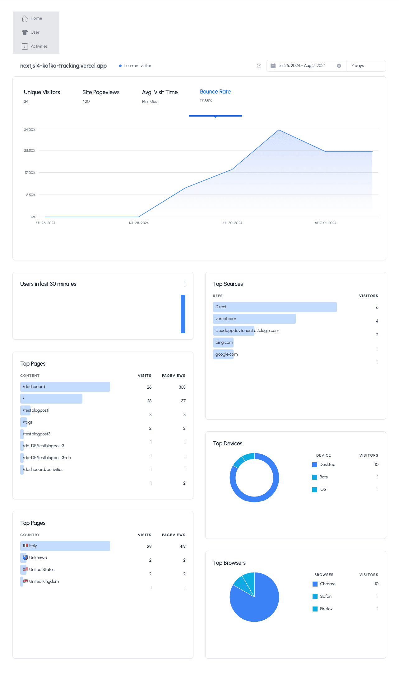
}Und hier ist das Endergebnis mit den neuen Widgets
Jetzt können wir die Tabs im oberen KPI-Widget verwenden. Die Farben der PIE- und DONUT-Diagramme sind korrekt, und wir können den Datumsbereich leicht wechseln/ändern.
Cloudapp-dev und bevor Sie uns verlassen
Danke, dass Sie bis zum Ende gelesen haben. Noch eine Bitte bevor Sie gehen: